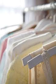
My chosen theme is "Assembled". I chose this because it caught my eye and seemed like an interesting topic to study and focus on. I would like to take pictures that seem abstract but still match my theme assembled. I would also like to take pictures of different objects with a plain background to create the image that I want and make sure its colourful at the same time.
I would like to take colourful pictures and images that would appeal the user. I like colourful images so that is why I chose this topic to take images like the specific photographers i'm going to research. I would wan to be able to take pictures with colours and shapes to create a sense of me trying to put something together or create my own images that inspired me from the photographer I'm going to research.
I would like to take colourful pictures and images that would appeal the user. I like colourful images so that is why I chose this topic to take images like the specific photographers i'm going to research. I would wan to be able to take pictures with colours and shapes to create a sense of me trying to put something together or create my own images that inspired me from the photographer I'm going to research.
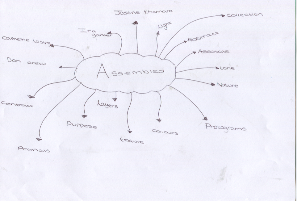
mind map of assembled
pinterest board for assembled
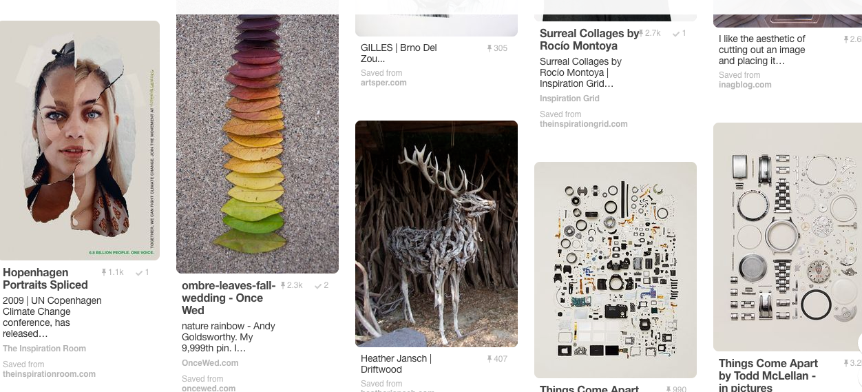
photographers I researched
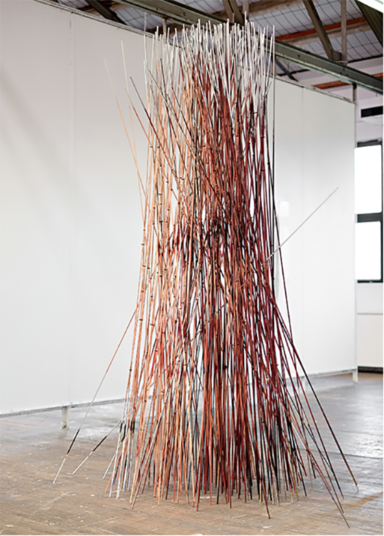
Ira garber
Garbers work is unordinary, his work is abstract and I like it because it is interesting to do and try to make the images as your own and refine it. Also he repeats his work but they all look good and all in focus to create a good effect and he also uses a lot of colour in his images and his work.
catherine losing
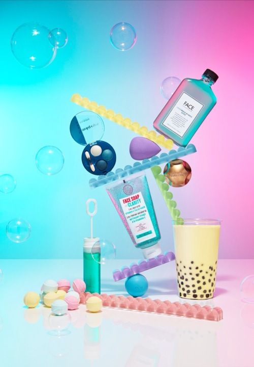
Catherine losing is a still-life photography. Her work takes inspiration from everyday life and makes it unique and abstract style. Her work is colourful and contemporary and has been exhibited in art exhibits across Europe and the U.S and by doing this she has attracted new clients across stills and films.
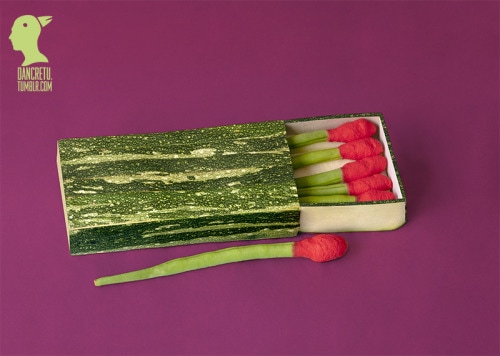
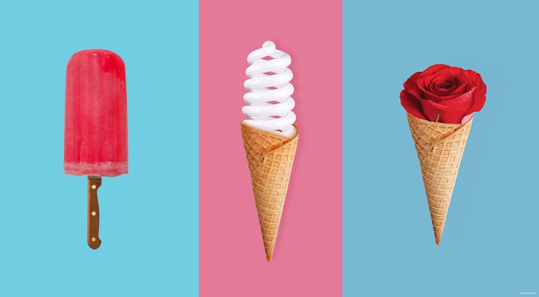
dan cretu
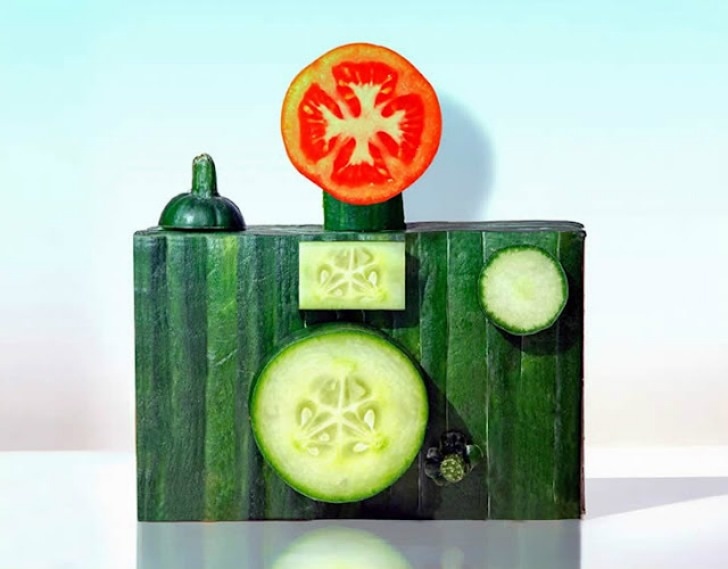
His work is appealing to me because when you look at it you want to know the purpose of why he made the image. His work is generally related to food which could mean he likes relating his images to food or wants to make us think he takes a general interest in food and what images you can make out of anything. He has made images which has been subsituted with fruit and vegetables. I think the aim of his images is to replace modern man made images with natural things such as plants also he probably does this to create a sense of a abstract image.
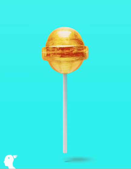
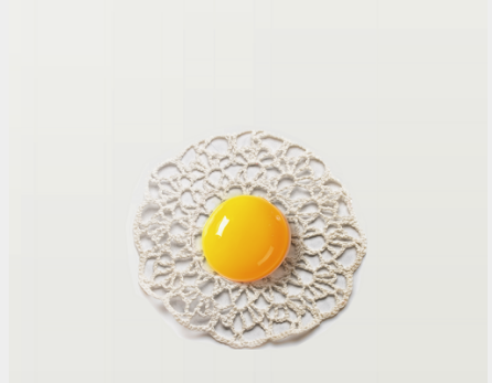
These are a few more images from Dan Cretu which I found interesting because they stand out more than his other pictures like they have a meaning to them, like things can stand out. I like how the lollipop is zoomed in on because it gives it more of an effect like it is just contast
Justine khamara
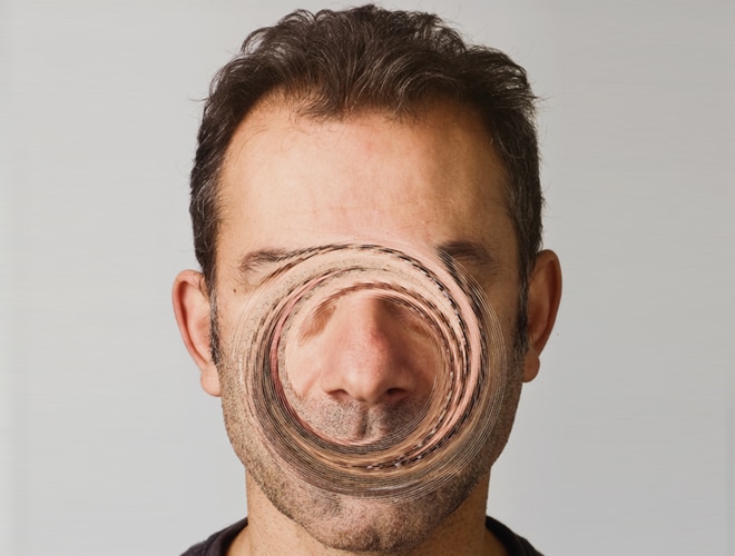
Khamaras work is created to be similar to all his other images. They are similar but abstract because he thinks outside the box and changes up his images by twisting around peoples faces and shredding the faces to make an image out of it. He makes the faces distorted but they have an interesting effect which makes you want to try an create similar images. I like his images because he basically does the same images but changes each and every one yo have its own abstract effect. I also like his images because their not like other photographers images he has his own form of work that just draws you in to know what it is about.
Comparing photographs
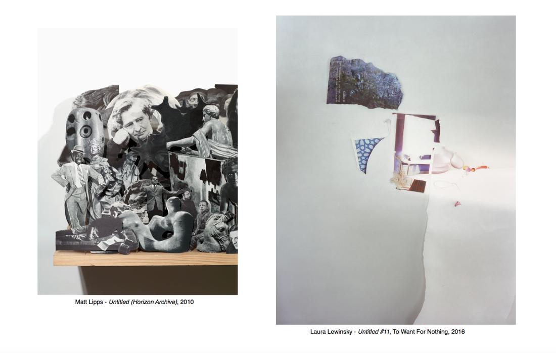
In the photograph from Matt Lipps I can see lots of images merged together to create a sense of imagery. The image looks like it is popping out. We looked at what makes it stand out and what we think is abstract about or inspirational about the photo. Lipps photo is presented as a abstract kind of image, it is a sculpture, it has composition and is in black and white which gives the person viewing it a sense of darkness. There is a sense of being cramped and the image is cramped together because it seems more abstract. It has a lot of layers with different photos to create an abstract image. Lipps clearly didn't want to have an ordinary photo.
I see lots of objects in a variety of ways. These pictures are both similar but different at the same time. He uses shade and black and white in the images and makes the image look effortless. The photograph has been taken in colour tho.
The photograph by Laura Lewinsky is in colour, the background is plain and pale. The composition of the photographs and I have seen both of the photographs have been made with paper and been cut out and has been arranged in a particular area. Matts image looks like its been arranged in a collage but Lewinsky's photo is kind of an organic style. By doing this both the images look cluttered or empty.
photo fanzines
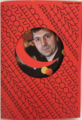
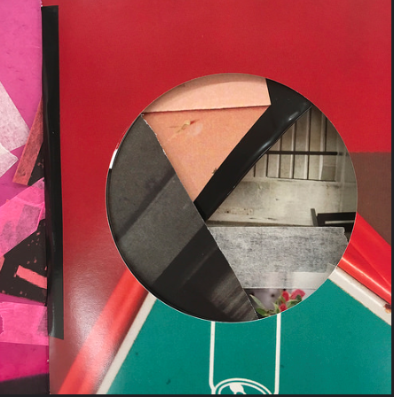
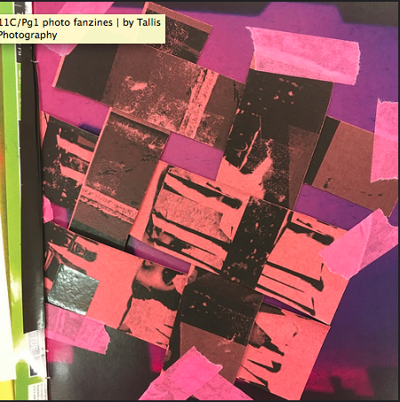
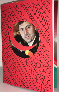
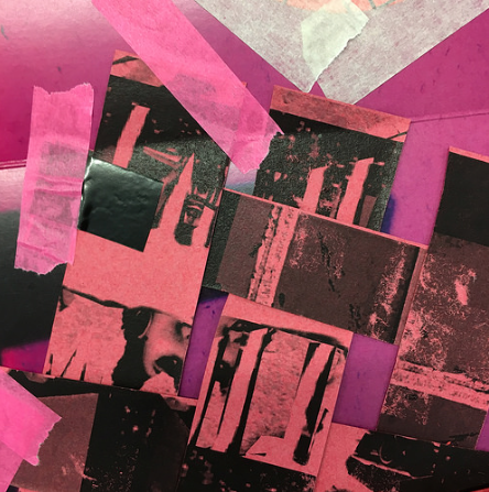
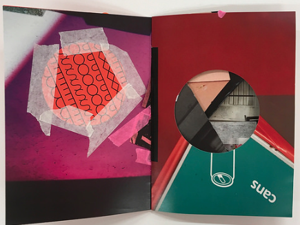
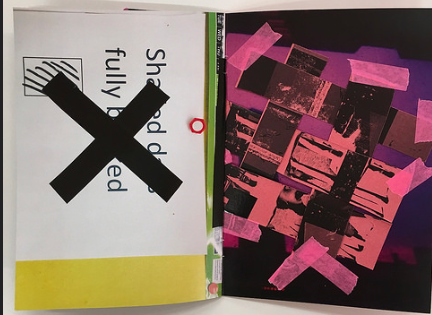
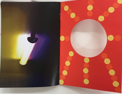
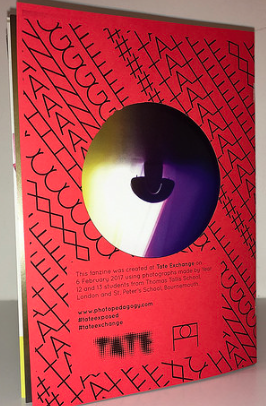
In these images we were using tape to stick paper together and stickers for our fanzines. We weren't allowed to use certain things such as scissors and glue. We had to be creative and use our imagination. We had to use the things we were given such as paper, stickers , scalpers and circle cutters. In my fanzine I stuck the paper together and used the circle cutter to cut out certain images and stuck some pieces with stickers. We were also allowed to use a scalper, which I used to make rectangles. I made sure it looked really abstract and unordinary. The back and front page of my fanzine is detailed because I used features and characteristics such as the front having a man staring through it with hole having rough edges.
Overall my fanzine went really well, it had a lot of bright colours. Each page was new and exciting which mad it enjoyable to make. I made sure it consisted of elements but not that much. There were lines and curves included as part of formal elements. It could have been improved by using more techniques, more elements and more images to make new and improved photos.
Overall my fanzine went really well, it had a lot of bright colours. Each page was new and exciting which mad it enjoyable to make. I made sure it consisted of elements but not that much. There were lines and curves included as part of formal elements. It could have been improved by using more techniques, more elements and more images to make new and improved photos.
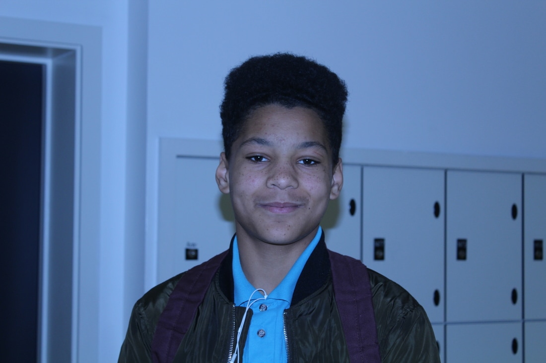
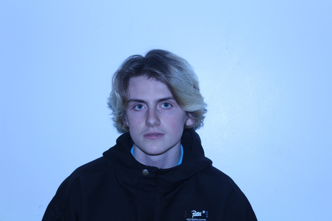
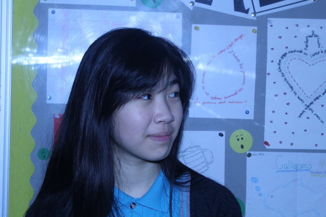
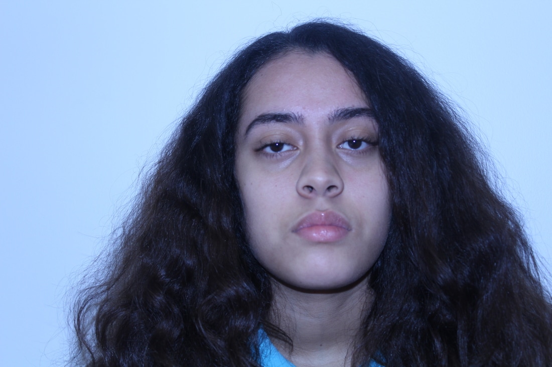
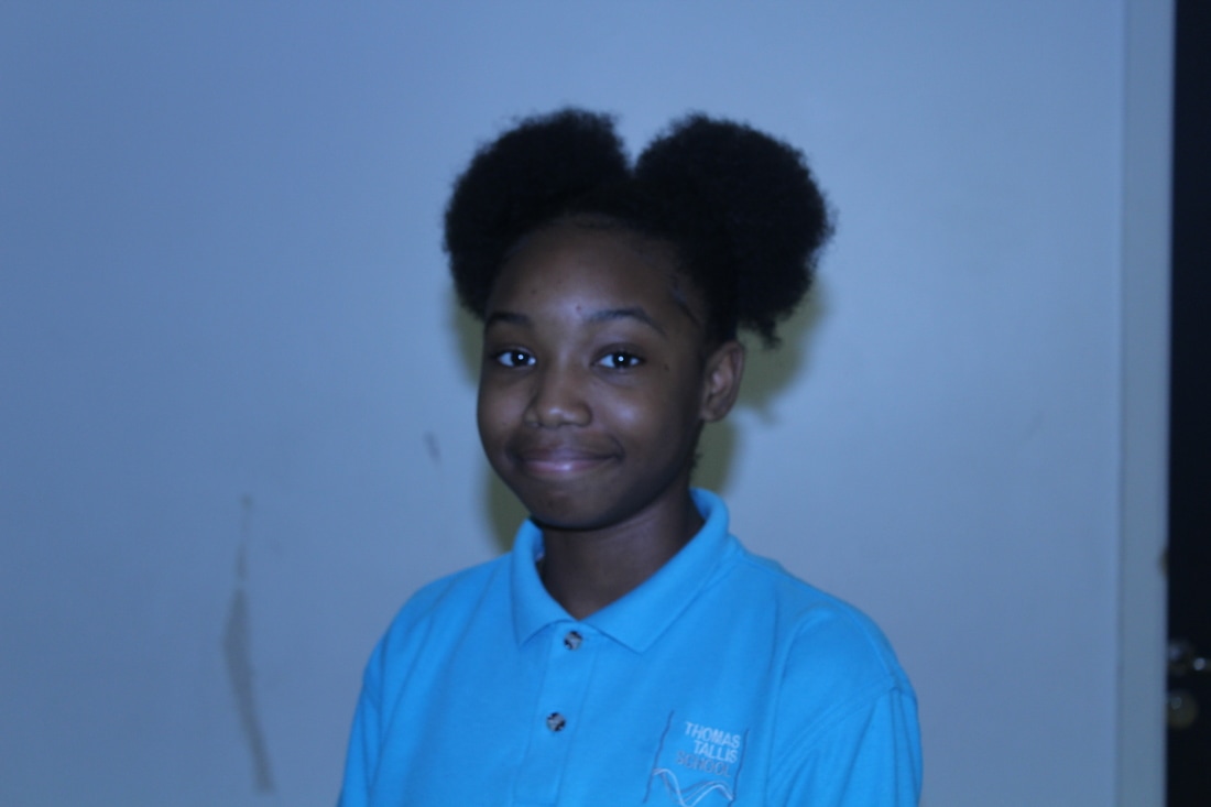
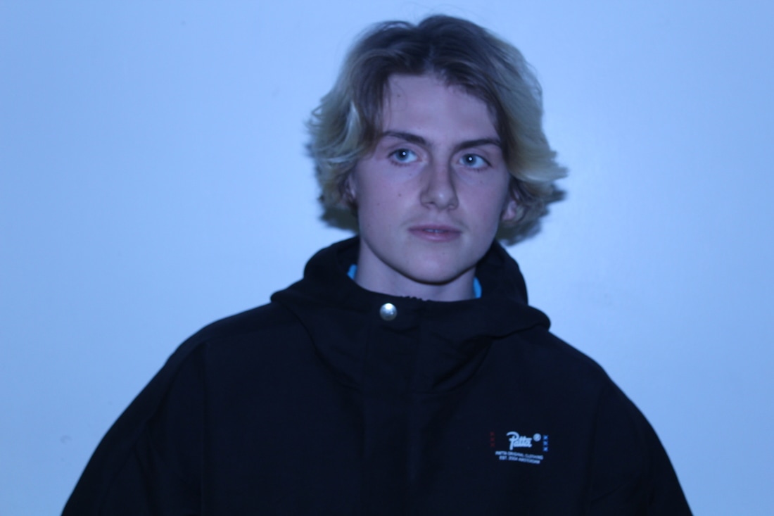
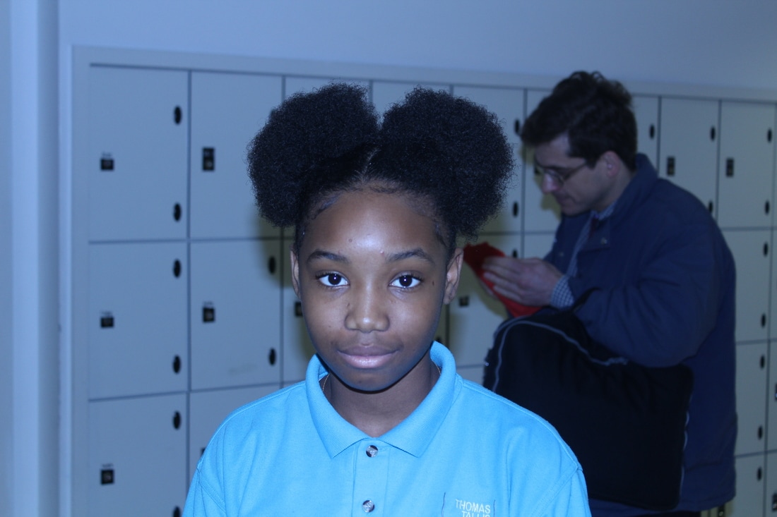
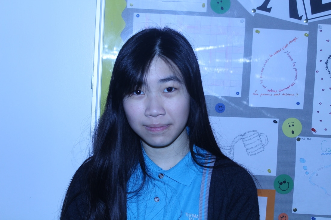
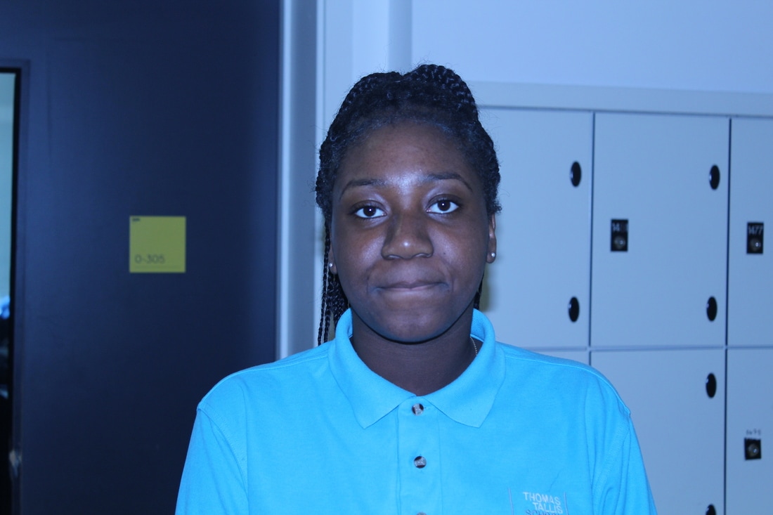
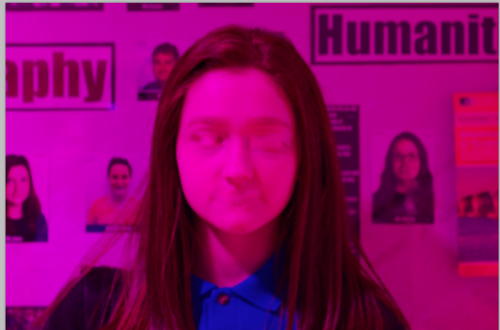
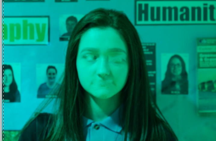
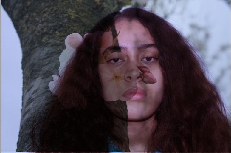
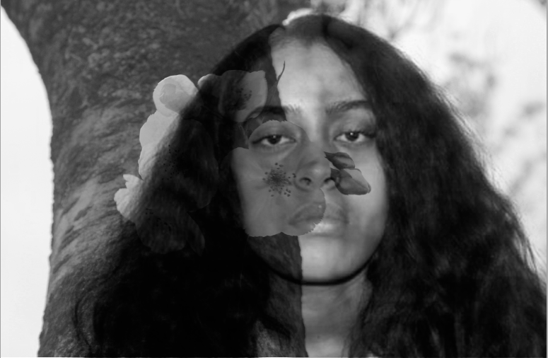
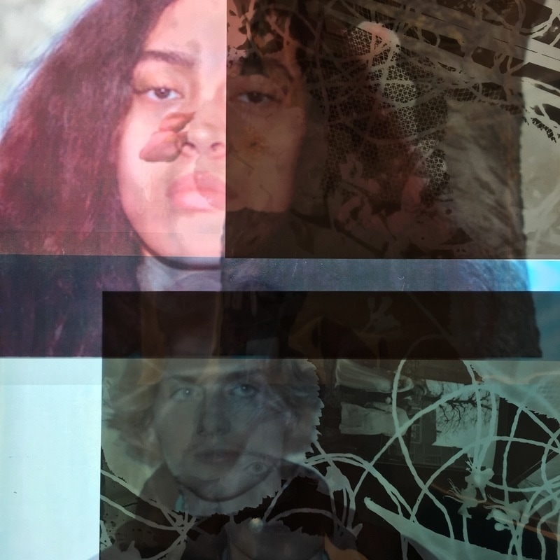
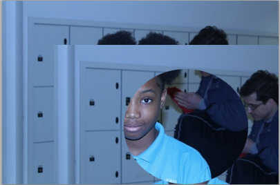
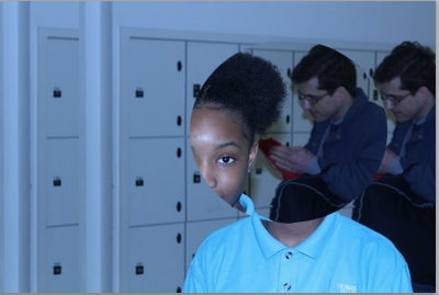
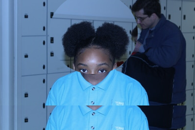
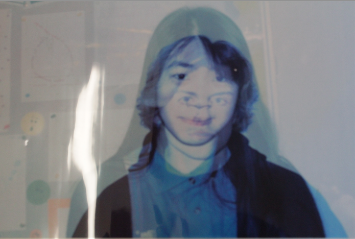
I took pictures of people in my school because I was using the faces to photoshop and make them abstract and different. My idea was to take two pictures of each person so I can mix their faces together and change it up. I researched some photographers work and looked at them so I can try and inpercenate them but then I had my own idea to try and mix peoples faces together and use different colours and shades.
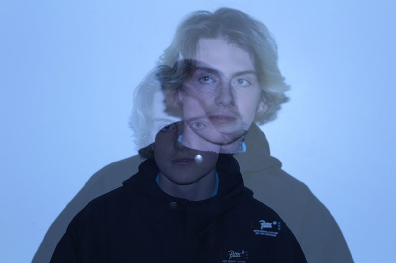
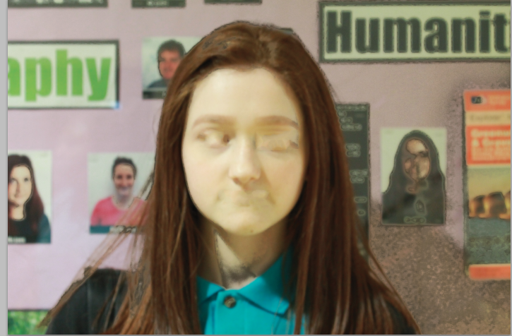
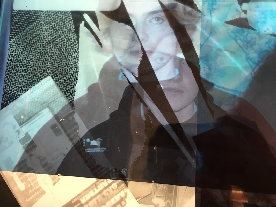
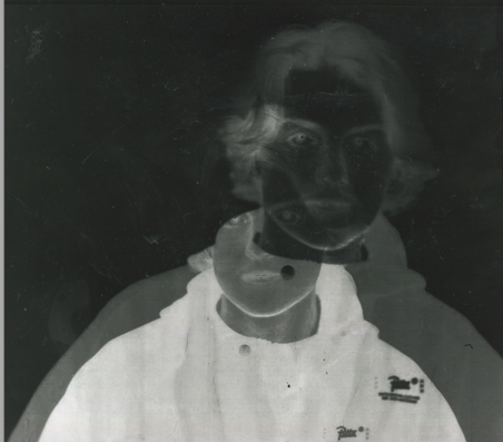
With this photo I saw Justine Khamaras work and I tried to make my photos look like his ones but I wanted to change it so It was my own work so I used shades and shadows and different colours. I like this photo because it shows you can make your own photos and they can look good. I tried to use more effects but I didn't know how to.
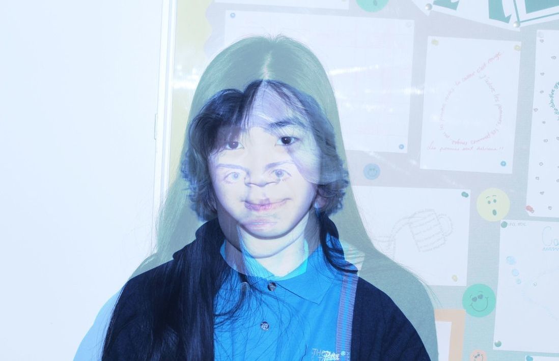
To make this image I used two photos of two different people and put them in photoshop to merge their faces together. I mad this as an experiment to learn how to use photoshop again. When I got their faces I didn't really know what to do so I thought of something that no one else is doing and tried it out to see what the outcome would look like.
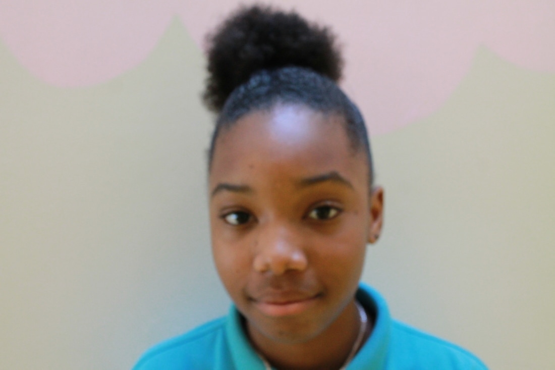
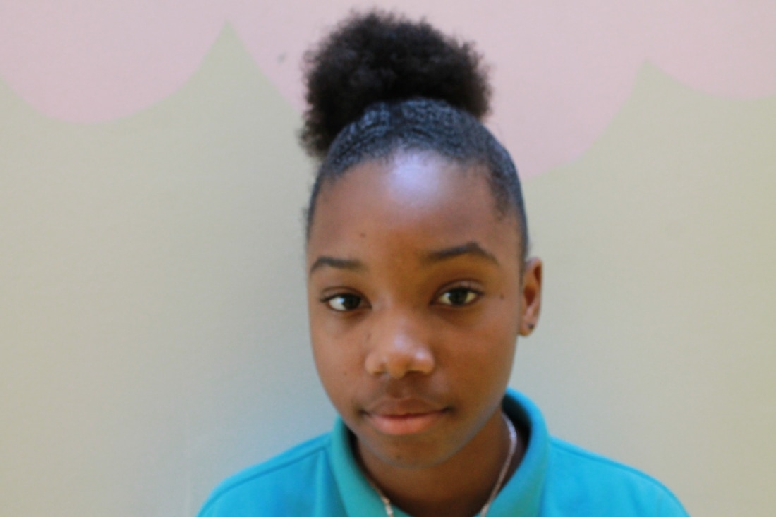
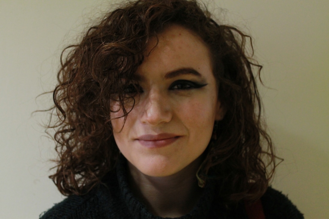
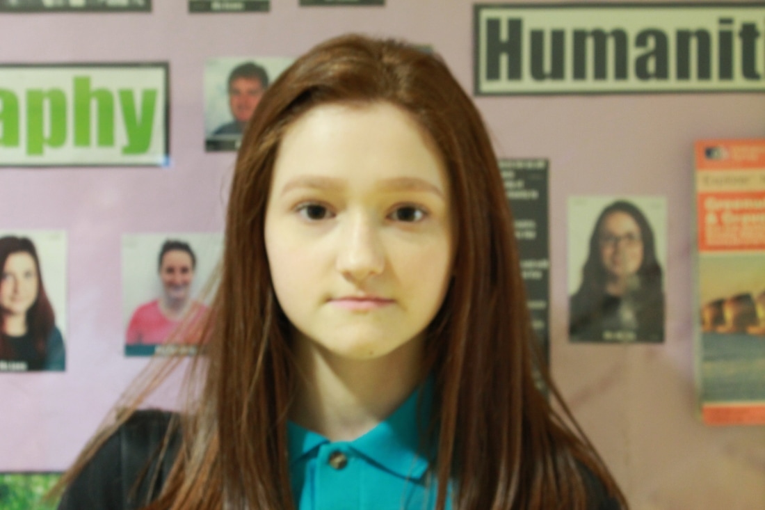
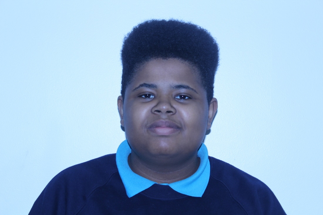
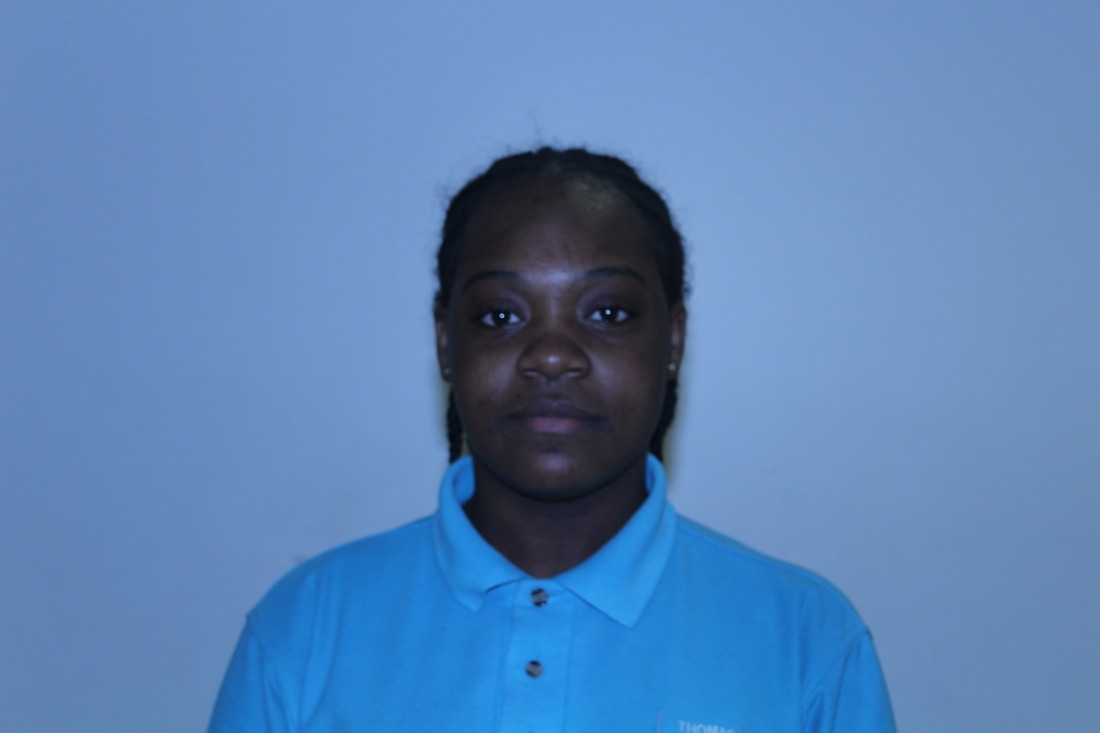
I took some more photos of students to use their faces in photoshop to use different effects and experiment and try to make new outcomes because I didn't know to do for assembled so I decided to get new faces to try them on. I tried to only get their face in because I was changing their faces around and putting effects on them. I wanted to make the faces upside down and use different faces on each other but at the time I didn't know how to use photoshop, as I said it was an experiment.
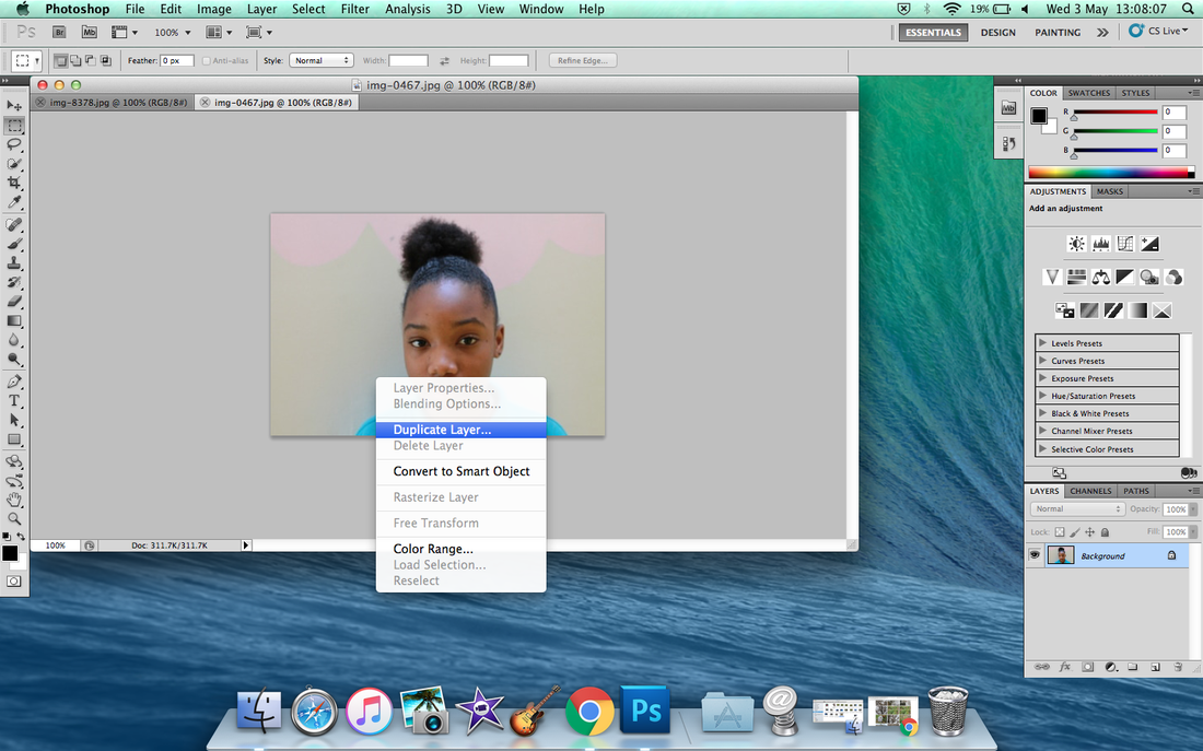
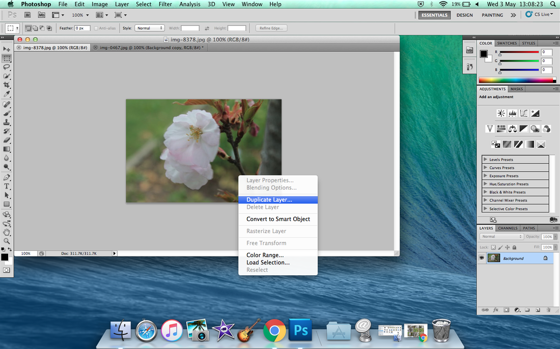
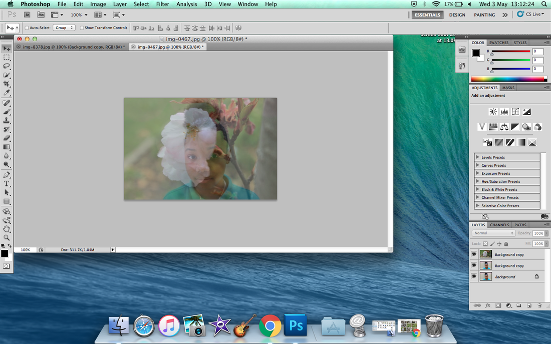
photoshop experiment
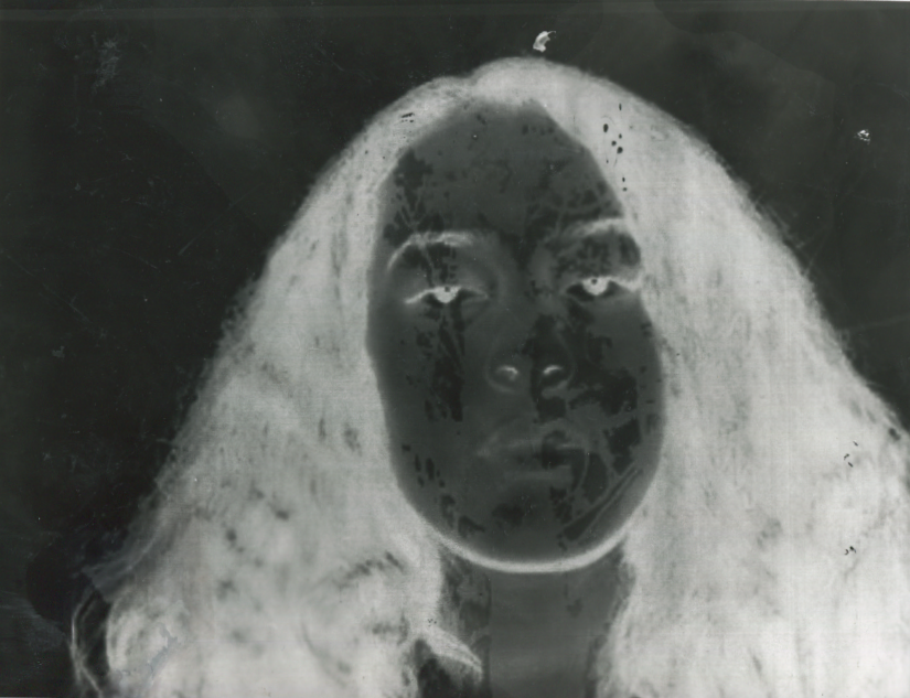
With these images I didn't know what to do so I started trying to figure out how to cover the eyes and mouth so I figured out that you have to duplicate the layers and then you have move the face to where you to put it and it will cover the which ever part you feel like covering as an experiment. When I was doing this I struggled for the first time because I thought I done it wrong until I noticed what I had done and I was like I can keep it like this because it is unordinary and no one would do this so I tried it and it came out like this.
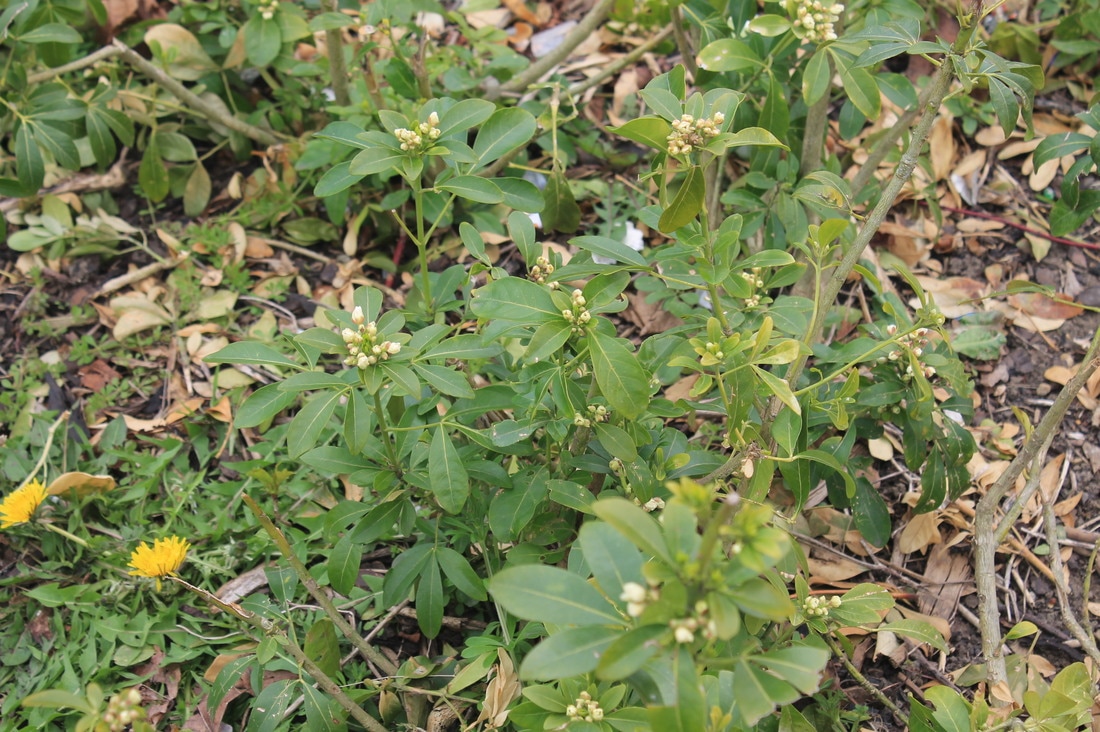
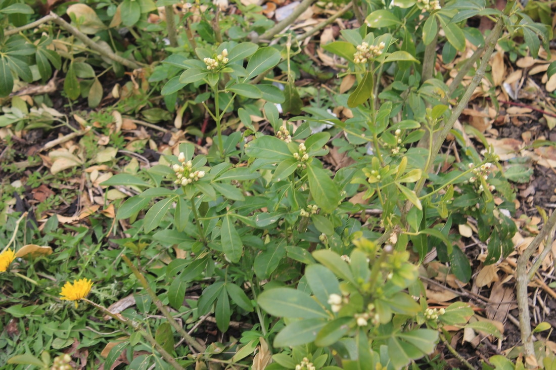
Natural images
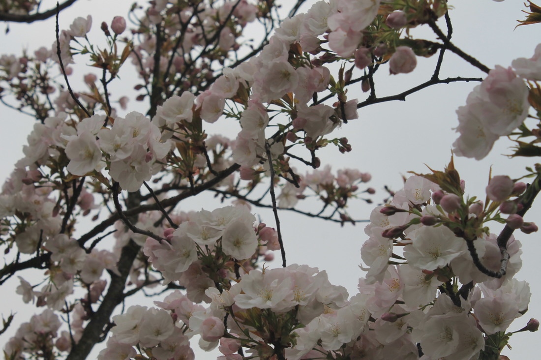
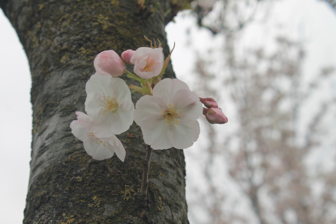
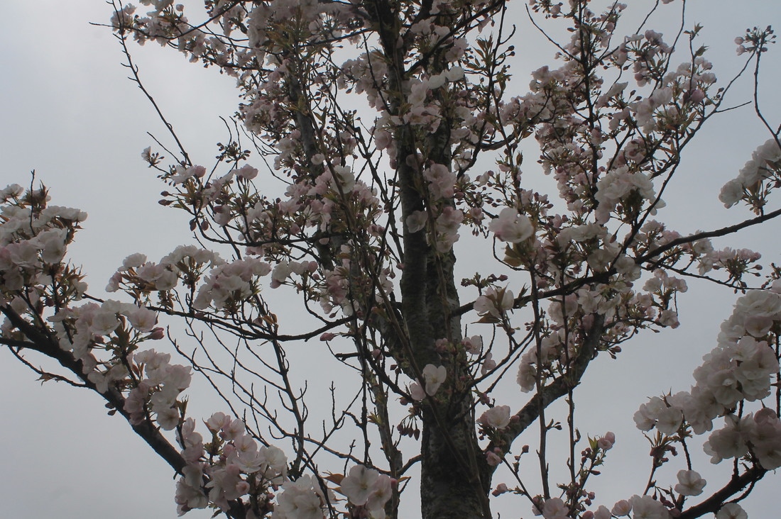
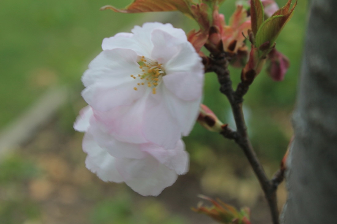
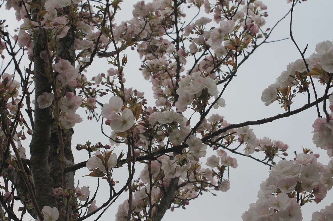
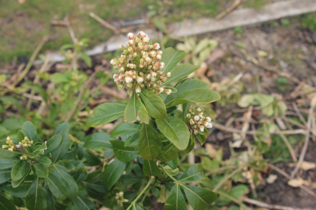
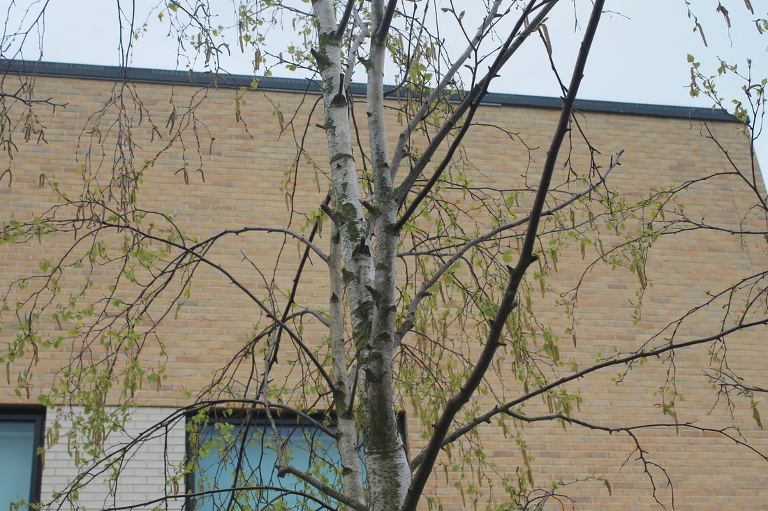
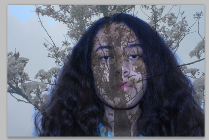
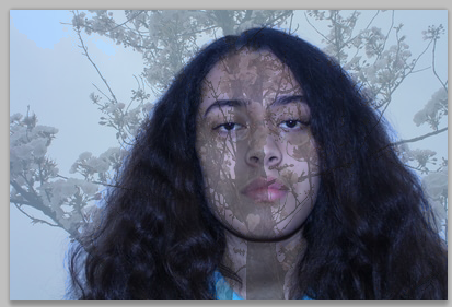
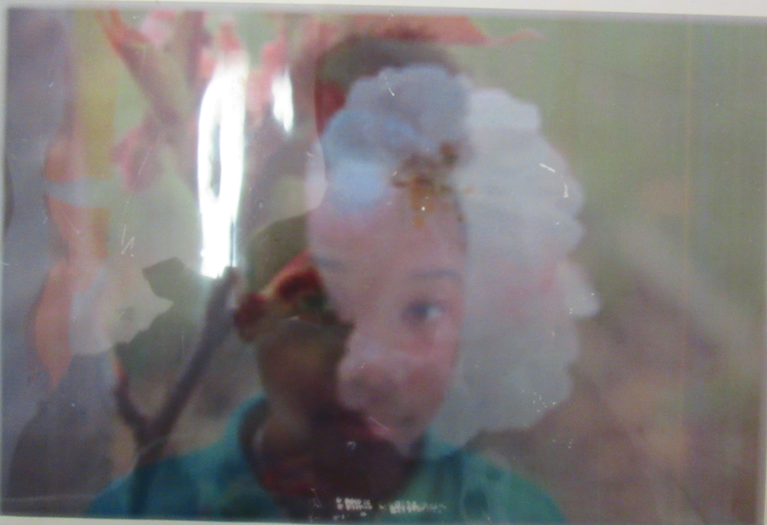
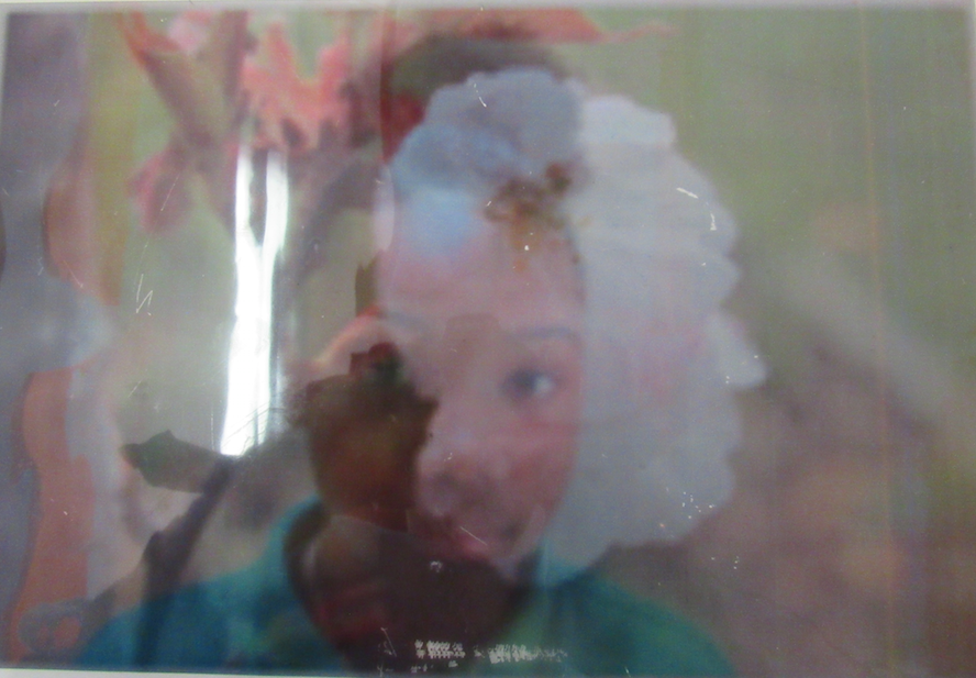
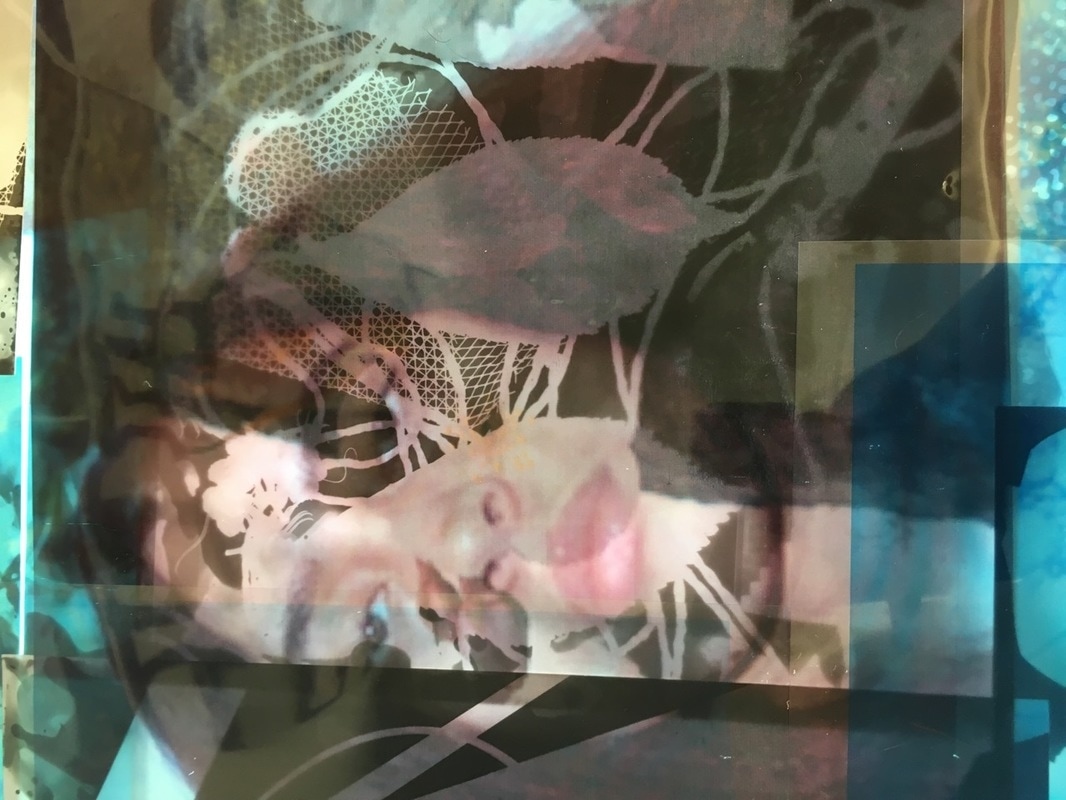
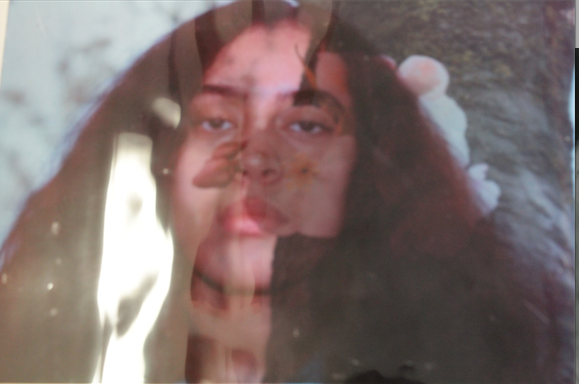
I decided to take natural images because in assembled people normally put other pictures together or objects and objects so I decided to take pictures of peoples faces and taking pictures of the natural world and merging them together to make an abstract look. I took specific images of plants such as trees and flowers because I thought it would look good put together with someones faces, really unordinary and interesting and someone would want to carry on looking at them.
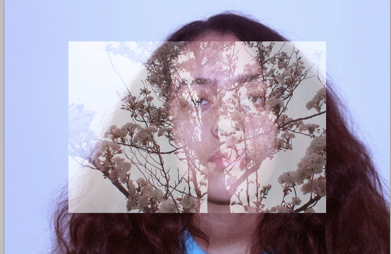
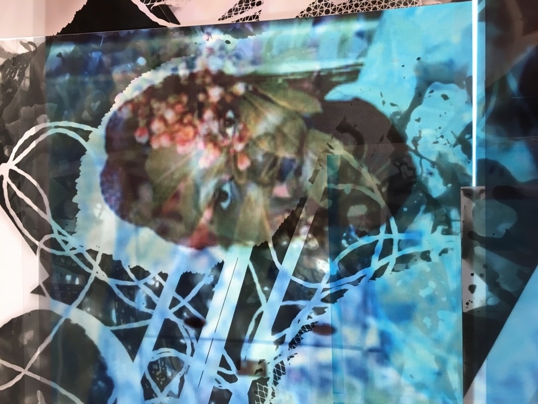
These are examples of me trying add nature to someones face and testing out how it would look. I tried to fade it out a bit more with the photo of the tree and the girl because you van barely see her face. In these images and used colour and no colour to make more of an effect. I made these by having pictures of the trees and the flowers and getting them up and then adding another layer(duplicate). Then combine them together and fade it out a bit so they are leveled and you can change the colour which I did. I had the photo of what it looks like with colour and without colour.
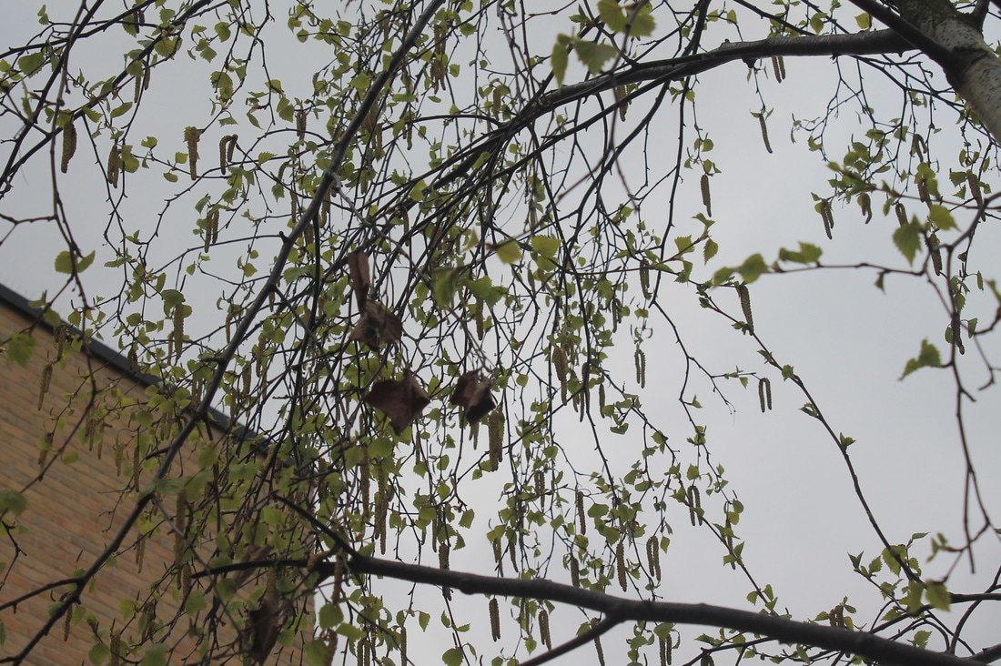
Some more natural images
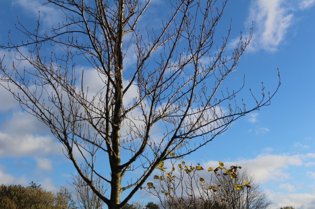
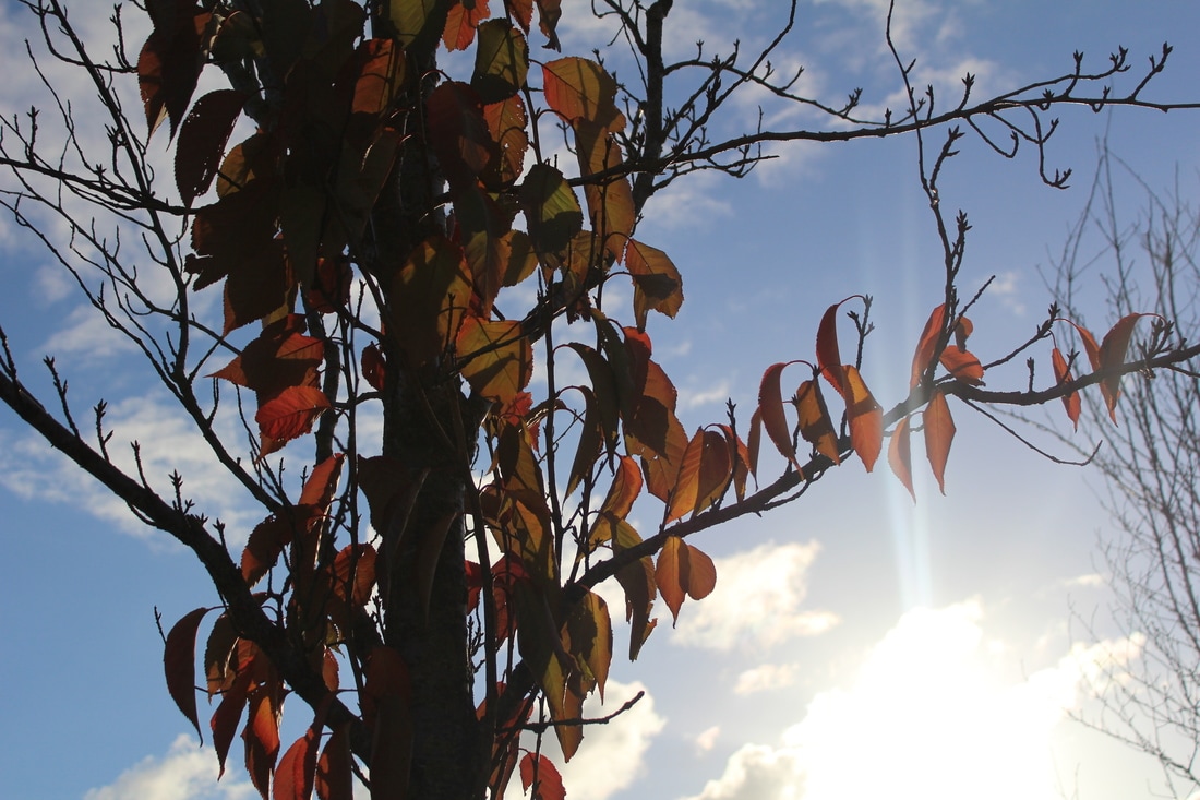
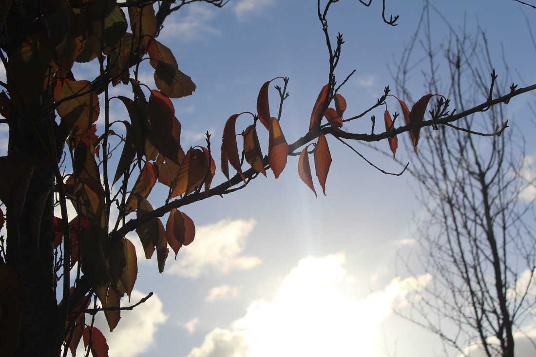
I took these photos because I thought I was going to use them but I had enough photos already so It was just some photos that looks really good. They are in focus and they have contrast and tone, it also has lines and curves in these images.
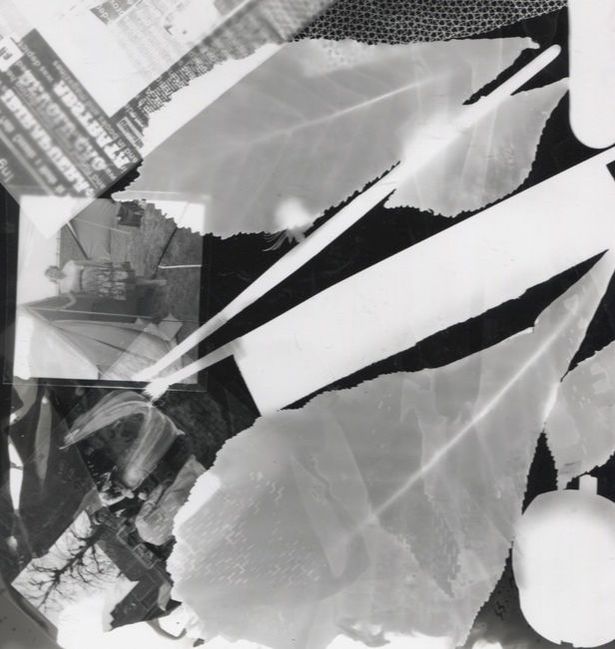
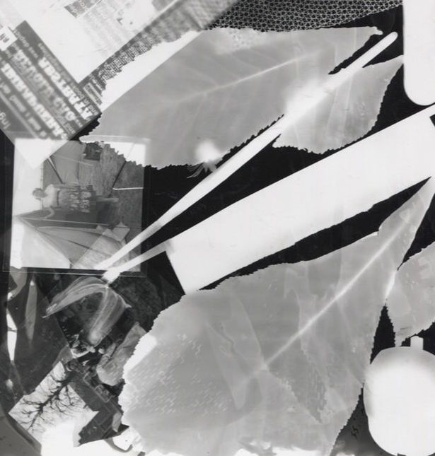
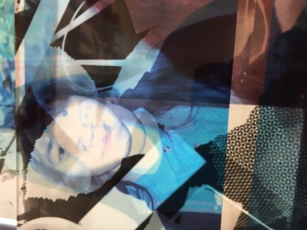
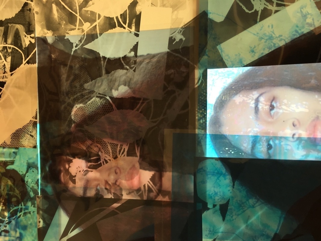
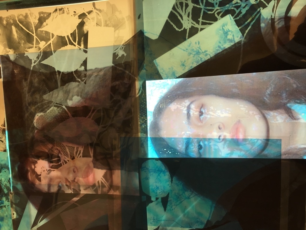
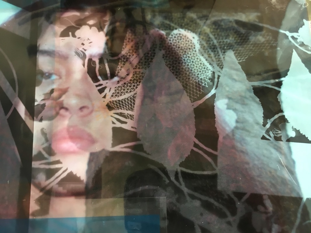
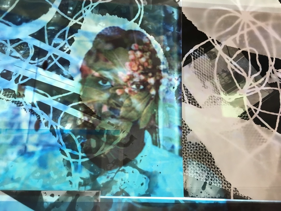
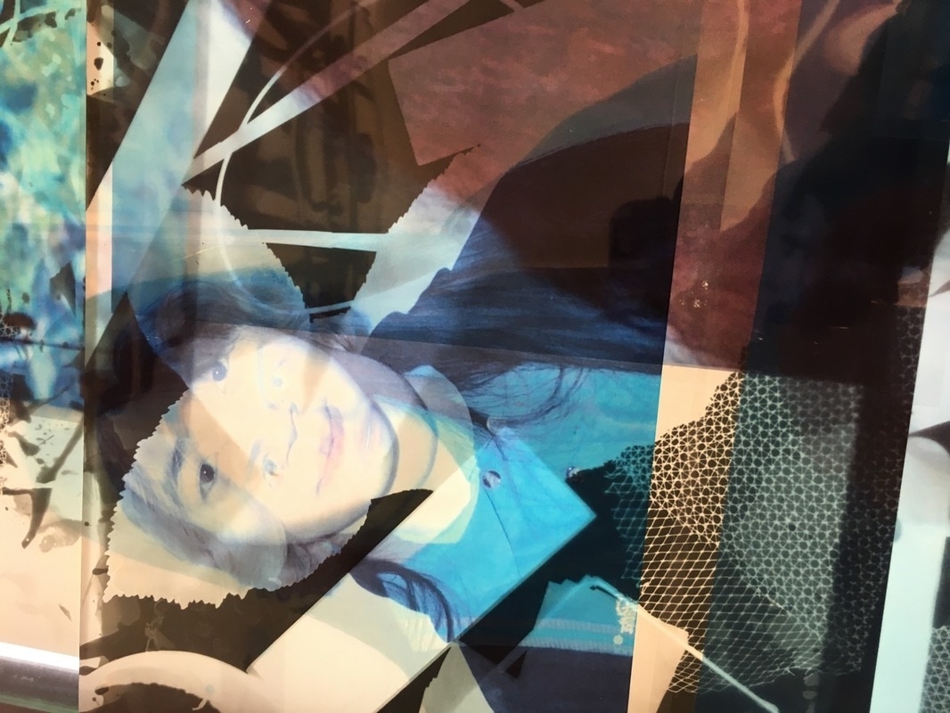
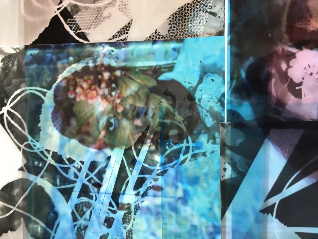
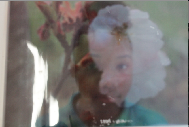
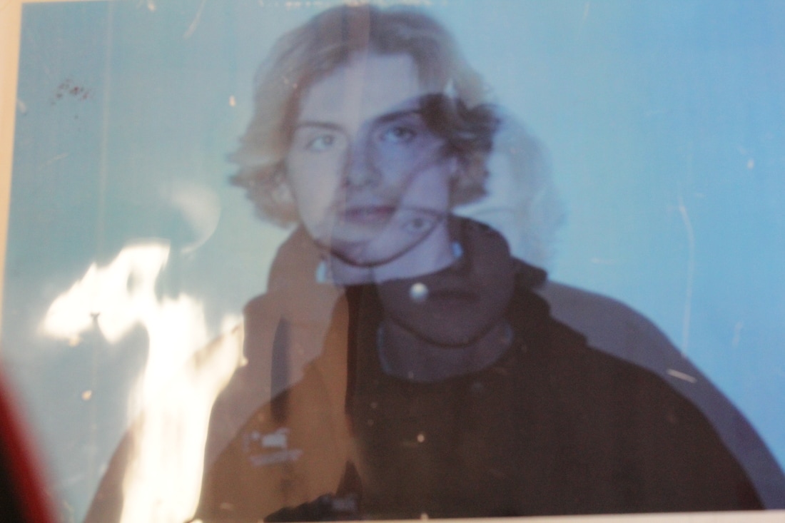
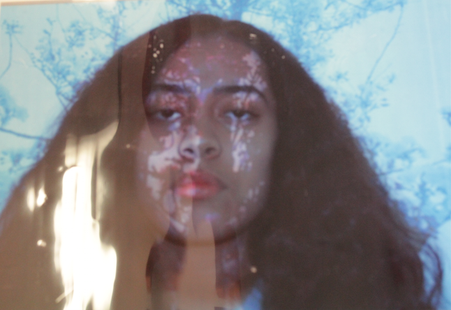
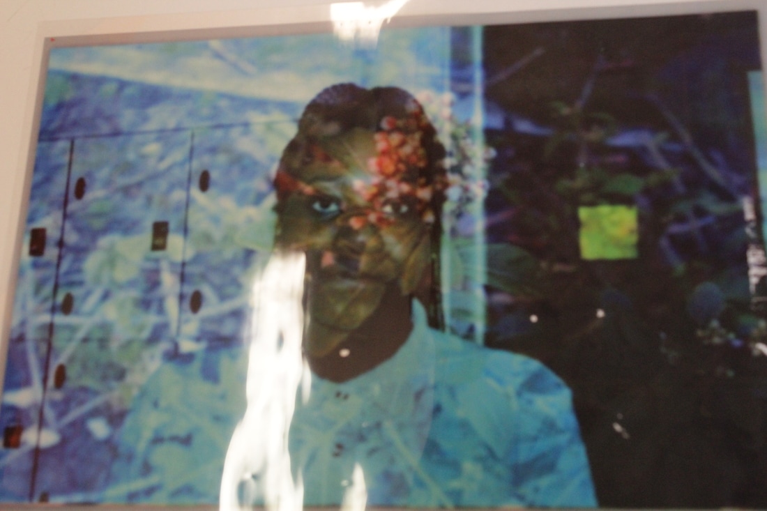
Images on the light box
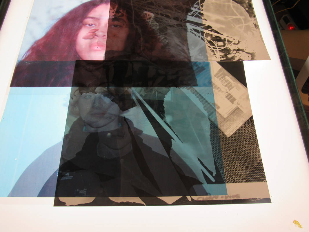
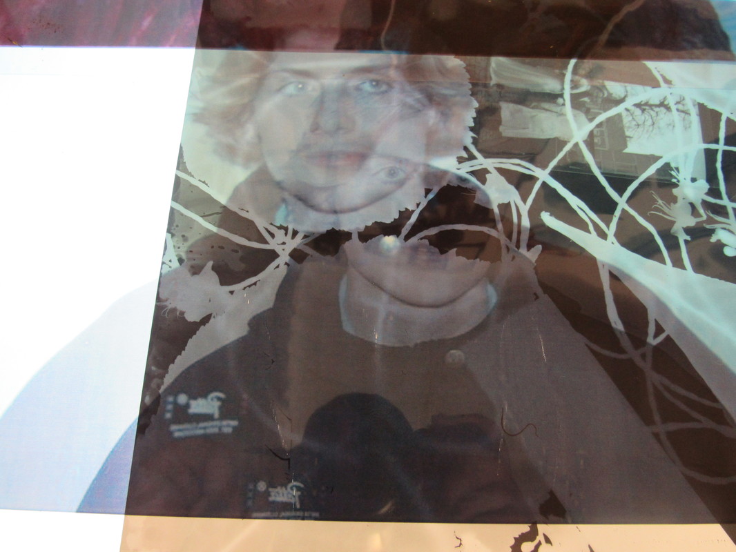
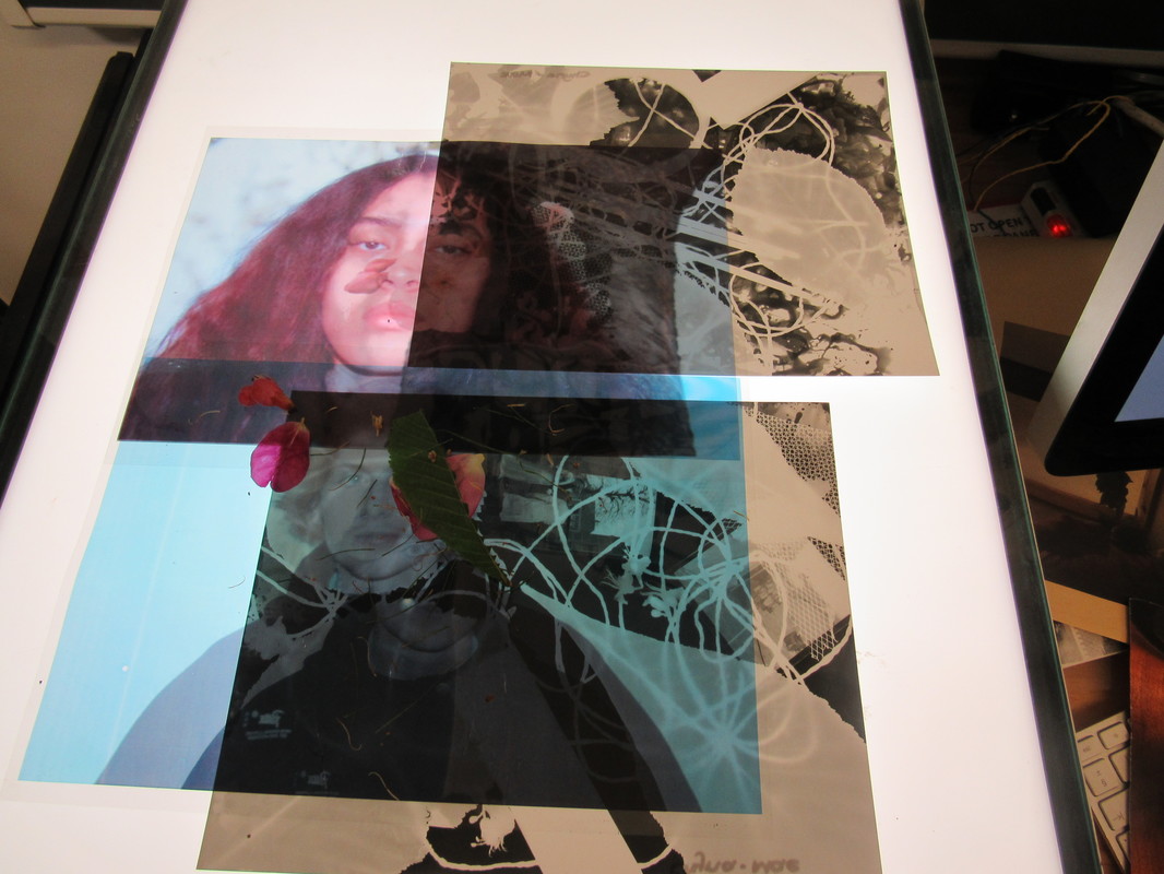
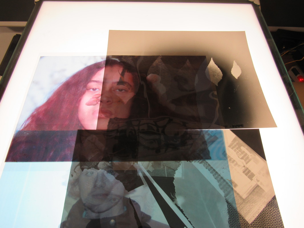
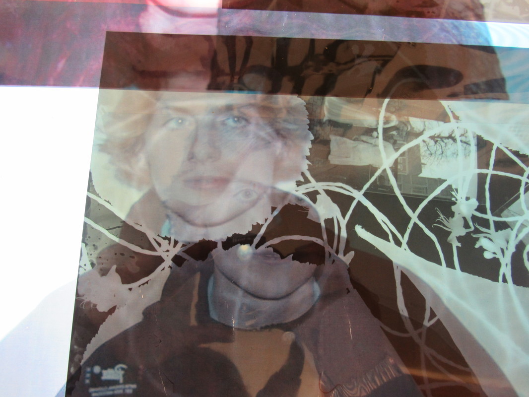
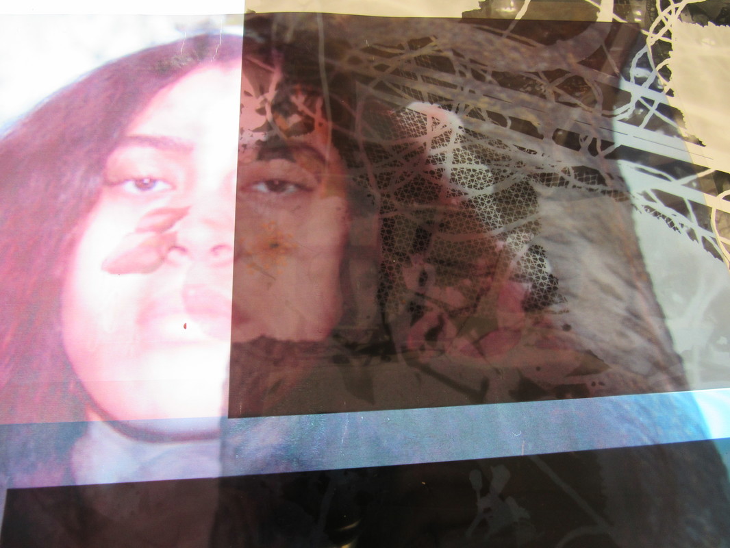
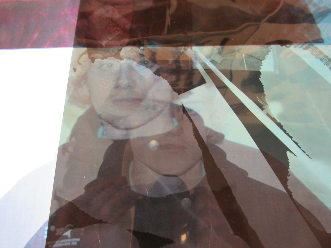
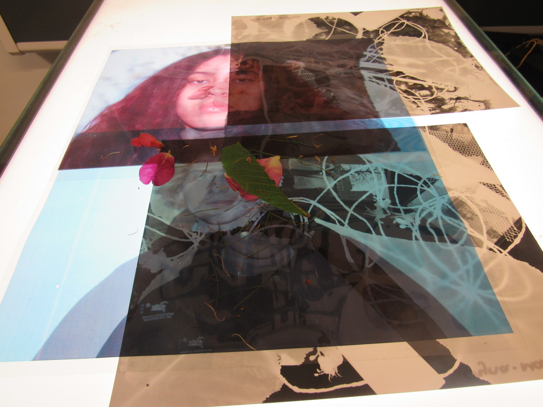
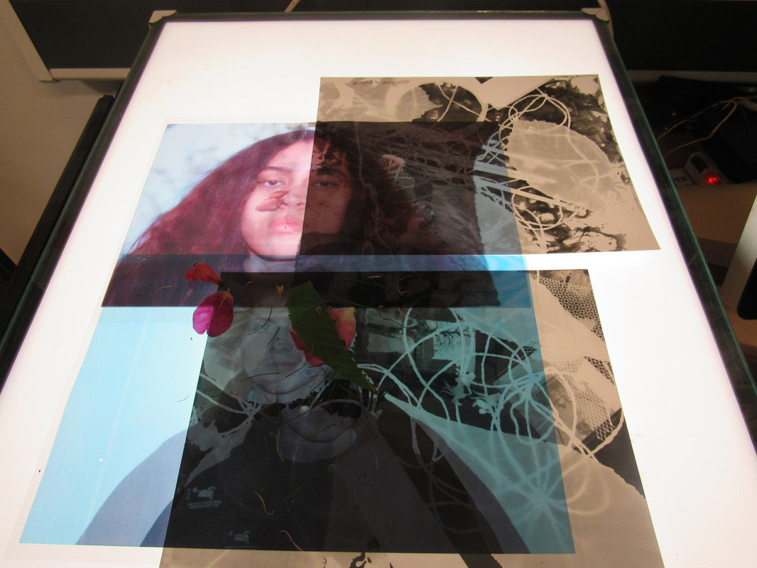
I made these photos on photoshop by combining the photos together which I said at the top. I wanted to print them out and I saw the transparent assotate paper so I decided I wanted to print it out on the that paper and it came out looking really interesting. I had my photograms that I made in the dark room and I turned on the light box. I put the photograms on first then put the transparent photographs on top of it and took the pictures. I made sure I picked certain sections to take pictures of because they were really compelling. When I picked a section I took the photo and changed the images around.
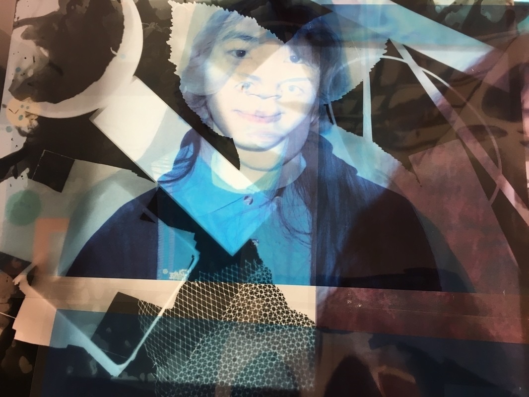
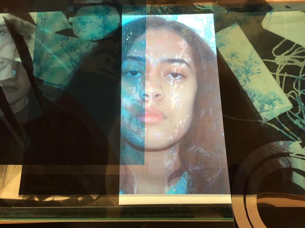
An example of photoshop
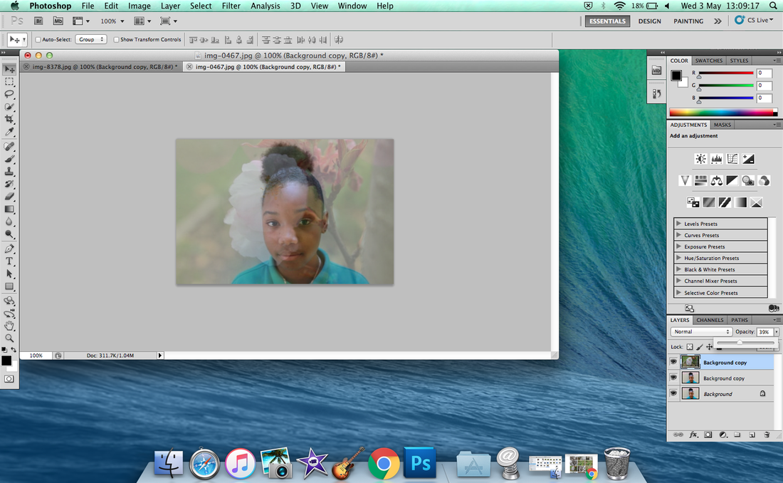
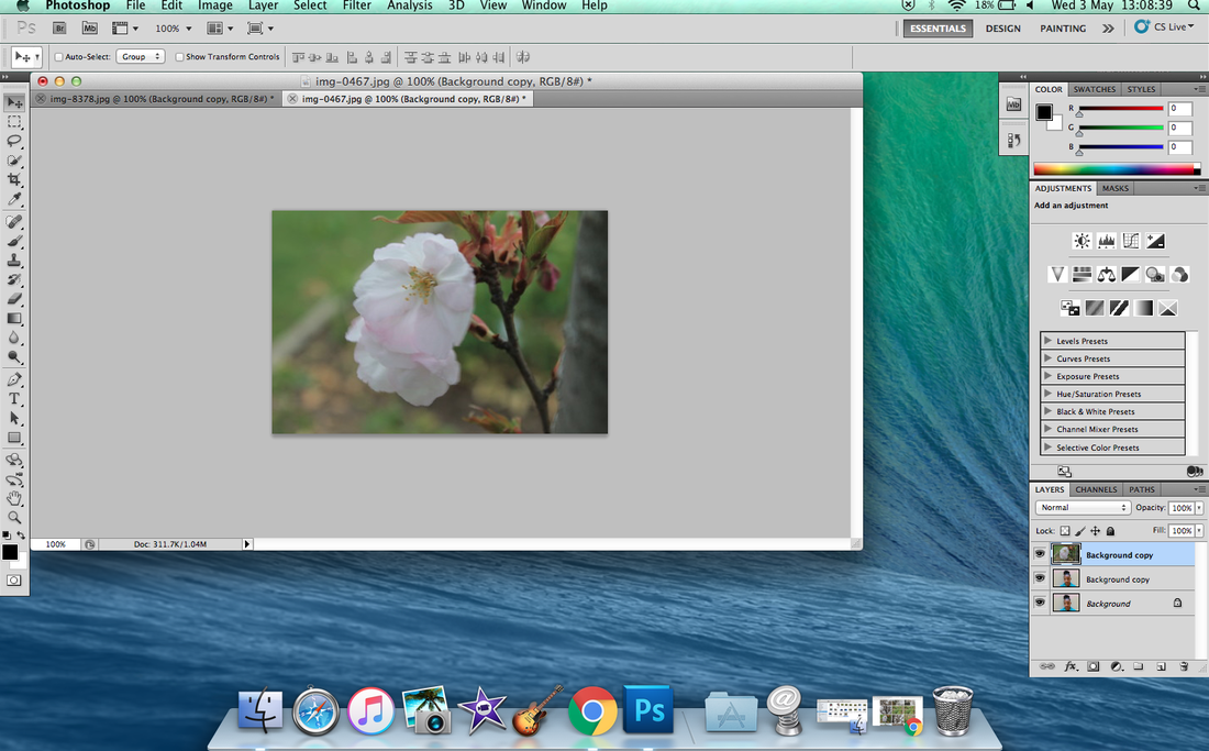
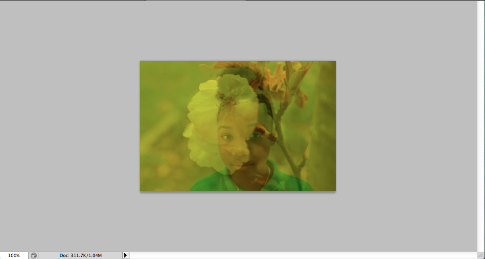
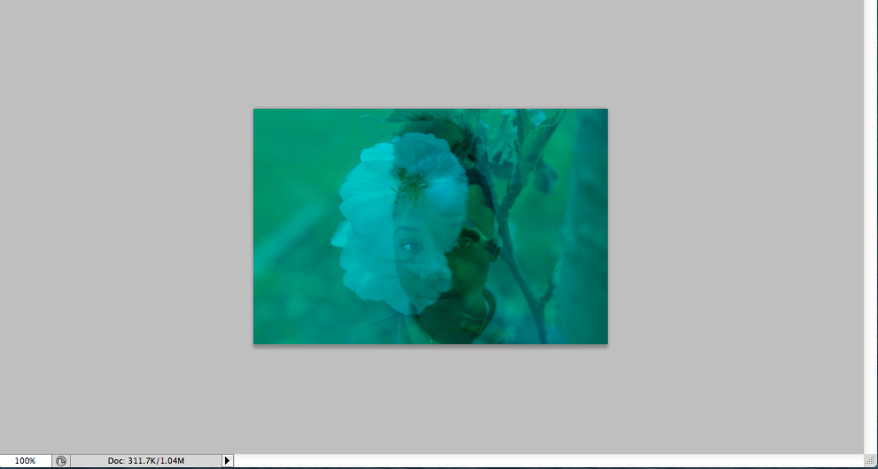
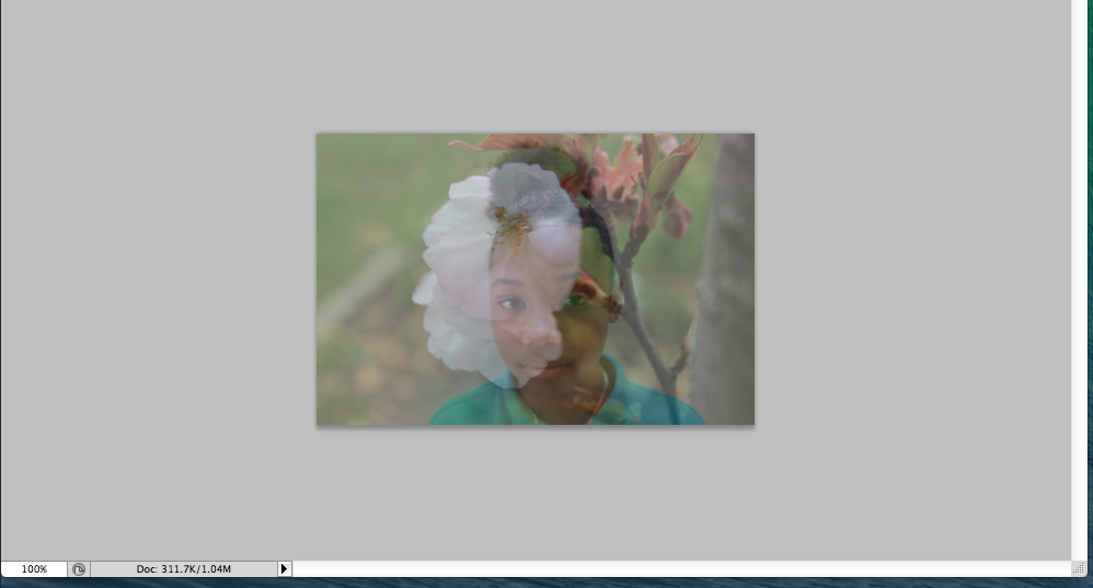
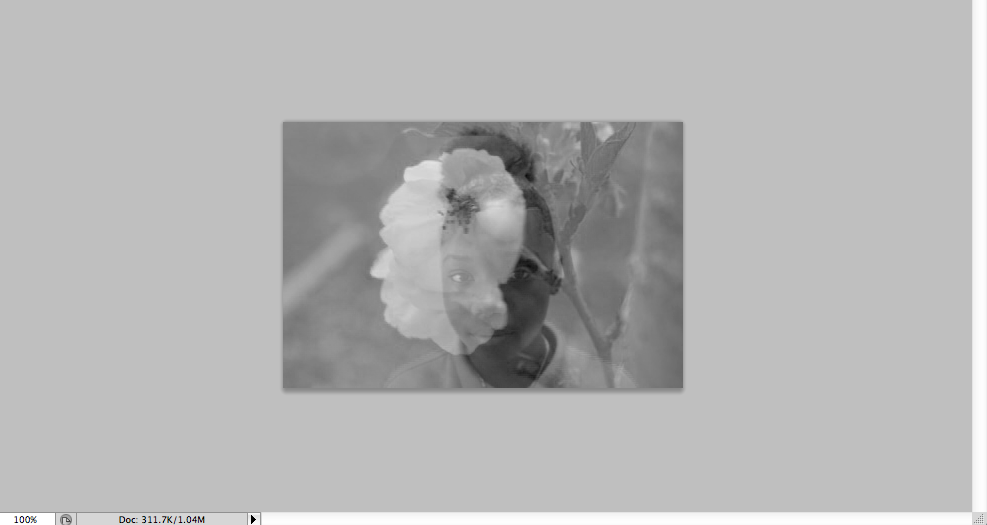
With this one I wanted to make another image because I kept using the same photos and the same faces. I took the flower photo because it stood out to me. In this I was showing you how you can do this kind of photoshop on your own. The first step is get the two images and duplicate the image and the second step is to combine them together by dragging it over. The third step is to fade it out and make it look good together. The fourth step is to change the colour if you want to change it. I used grey, blue, yellow and the normal colour.
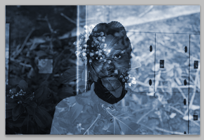
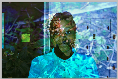
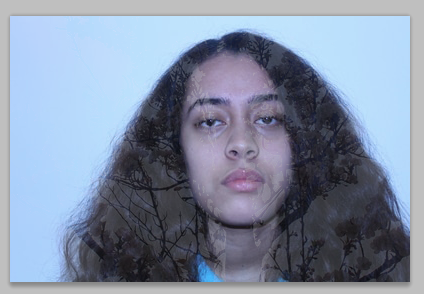
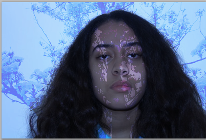
I made these images in photoshop. I made them like this because with this topic you can put anything together, I like to make my images relate to each other. I used different techniques to put trees on her face and fade and it and leave it how I added it to the image. I also changed the colour to see which one stands out more and looks more compelling.
my photograms
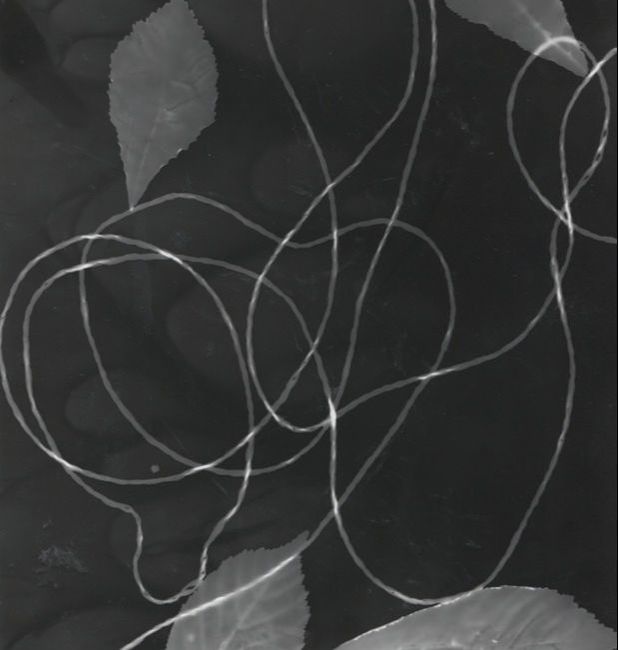
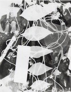


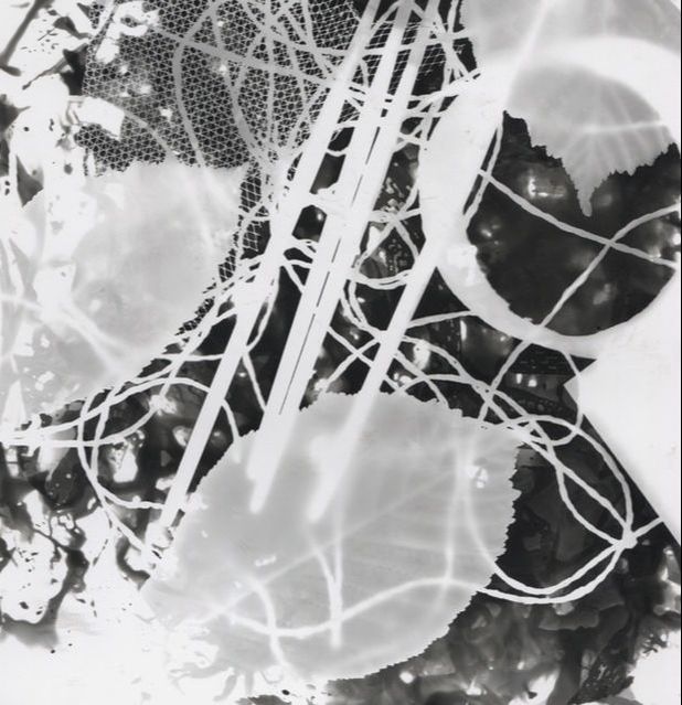
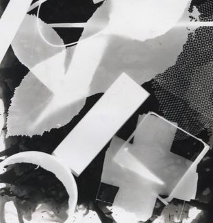

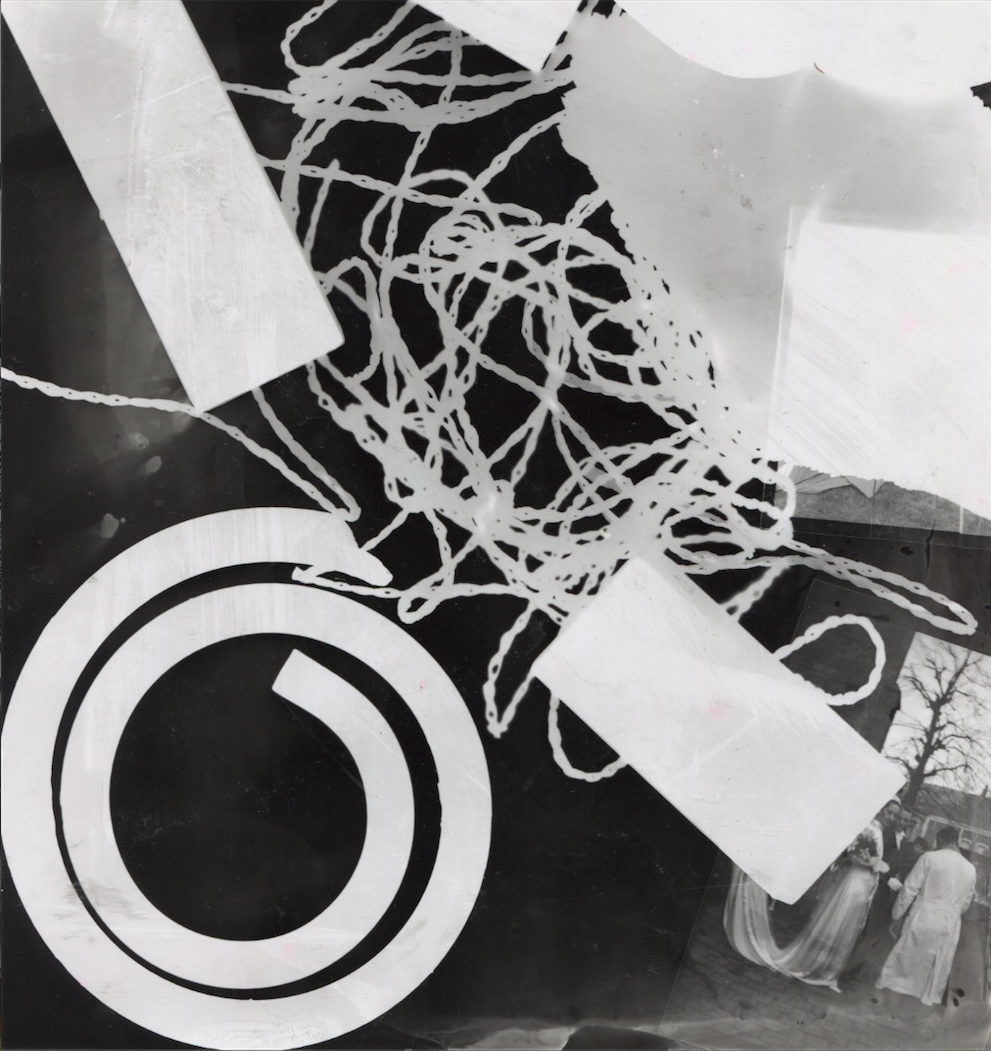
These are a range of images I made in the dark room because I wanted to experiment on what photograms I can make to do with the theme assembled. I started off with leaves but decided to add more objects because it wasn't really assembled if there is only leaves so I got more objects and assembled them in any order because it only needs to be put together.
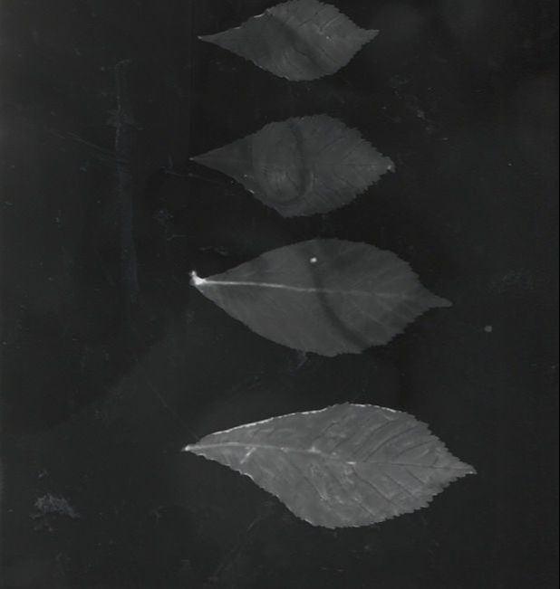
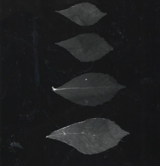
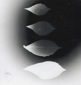
I was experimenting with leaves and putting them together and I noticed that I was leaving the light on it for too long so It wasn't coming out properly, it was either coming out too dark, too light or dark on some parts and light on others but It turned out nicely and looks abstract and has a lot of focus. The first and second photo came out dark but it has straight lines. The second photo was light and dark because the light was only focused on one particular part of the photo but the photo has tone.
I wanted to print out these photos using assotate but this one was too pixelated to come out looking clear. When I was printing it the image was too small to fit on A4. I like this image because I combined the flower to her face and wanted to put it on the transparent paper like all the other images I used in photoshop. This image is too blurry and is a fail and I am recording it because it is good to put everything that you have done to add to the experimentation.
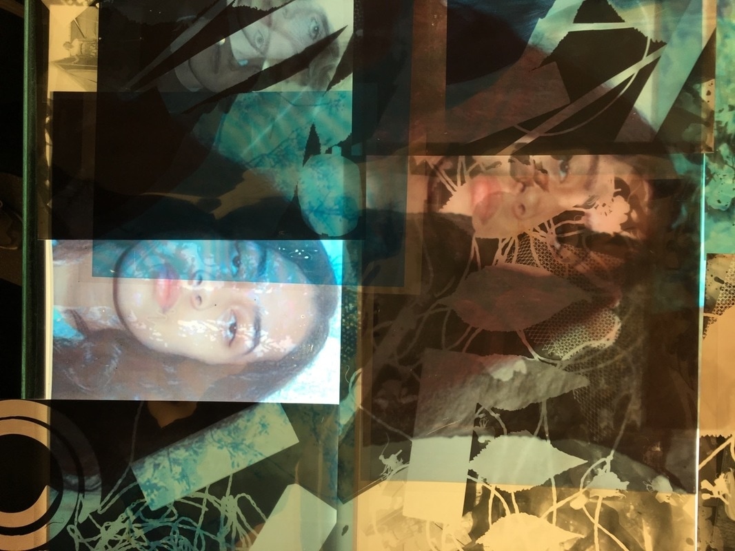
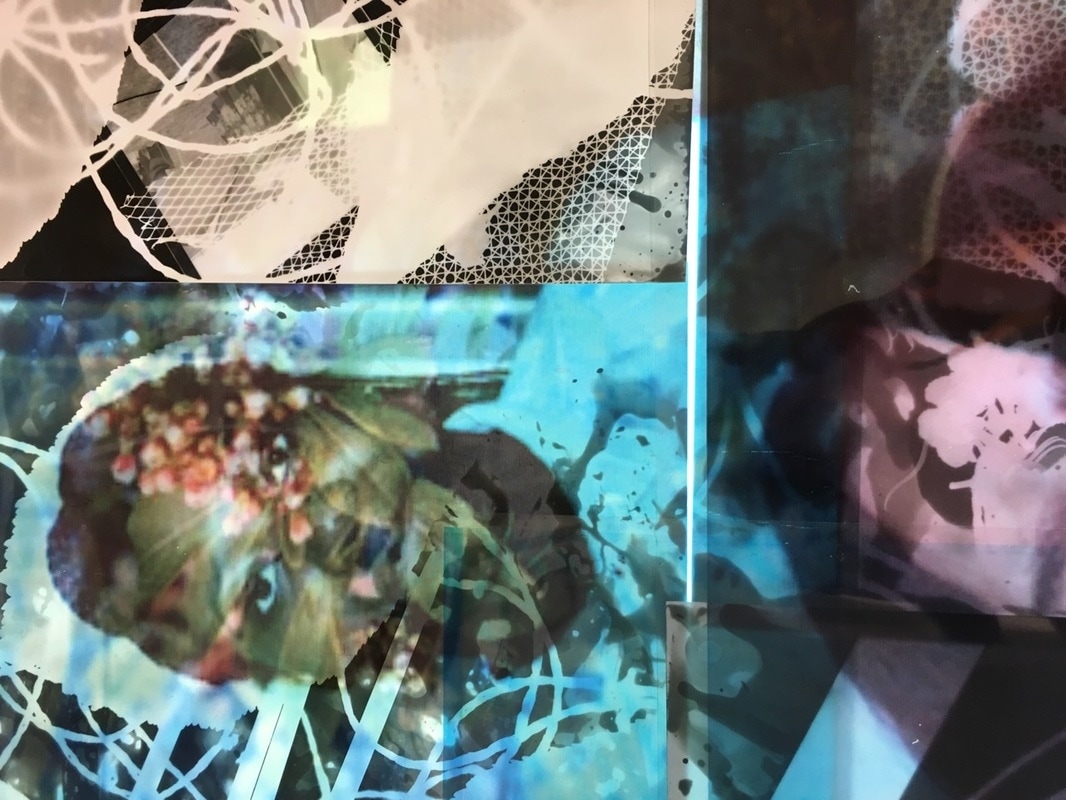
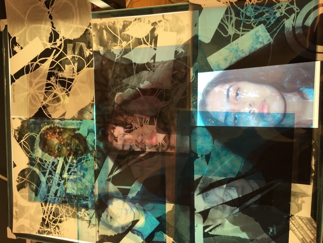
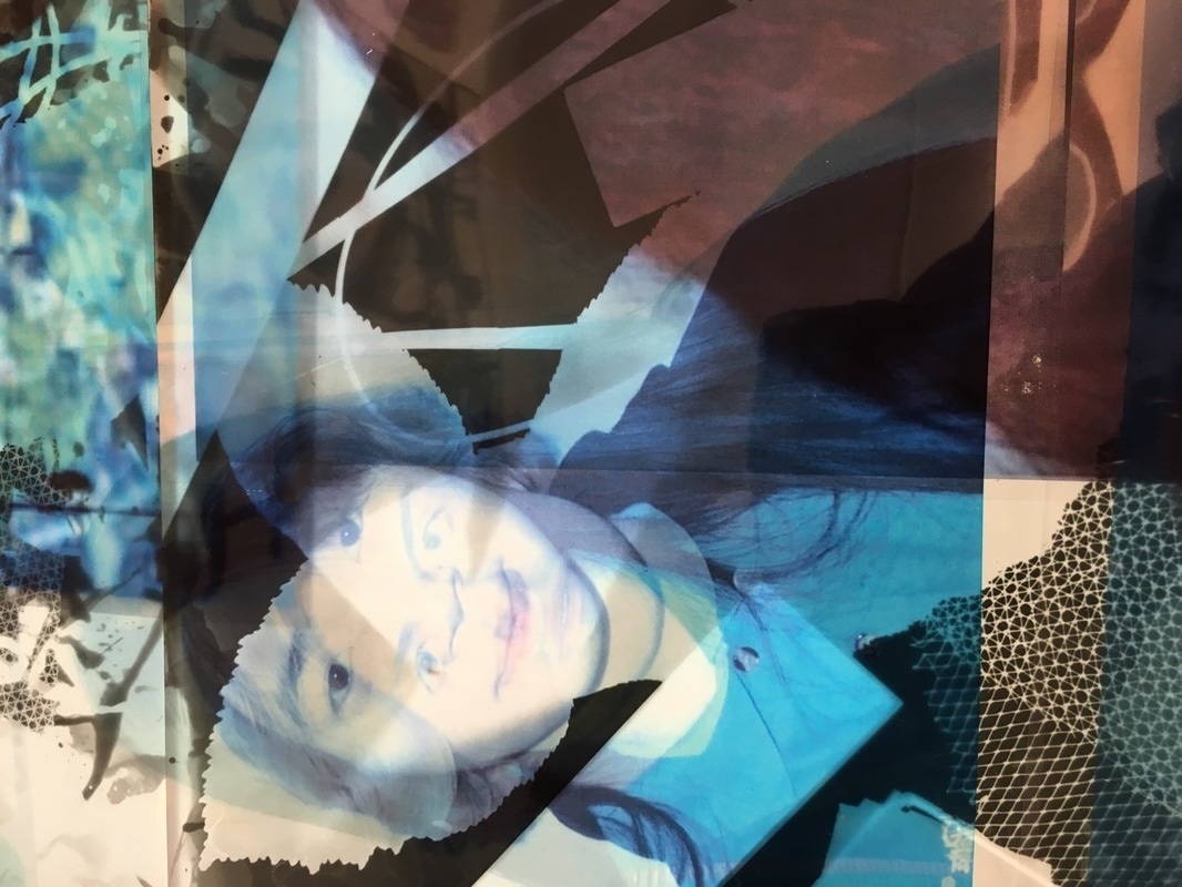
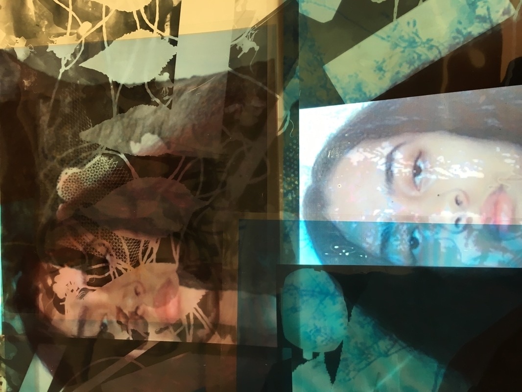
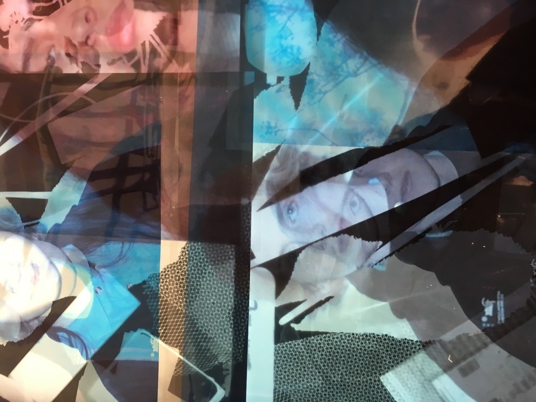
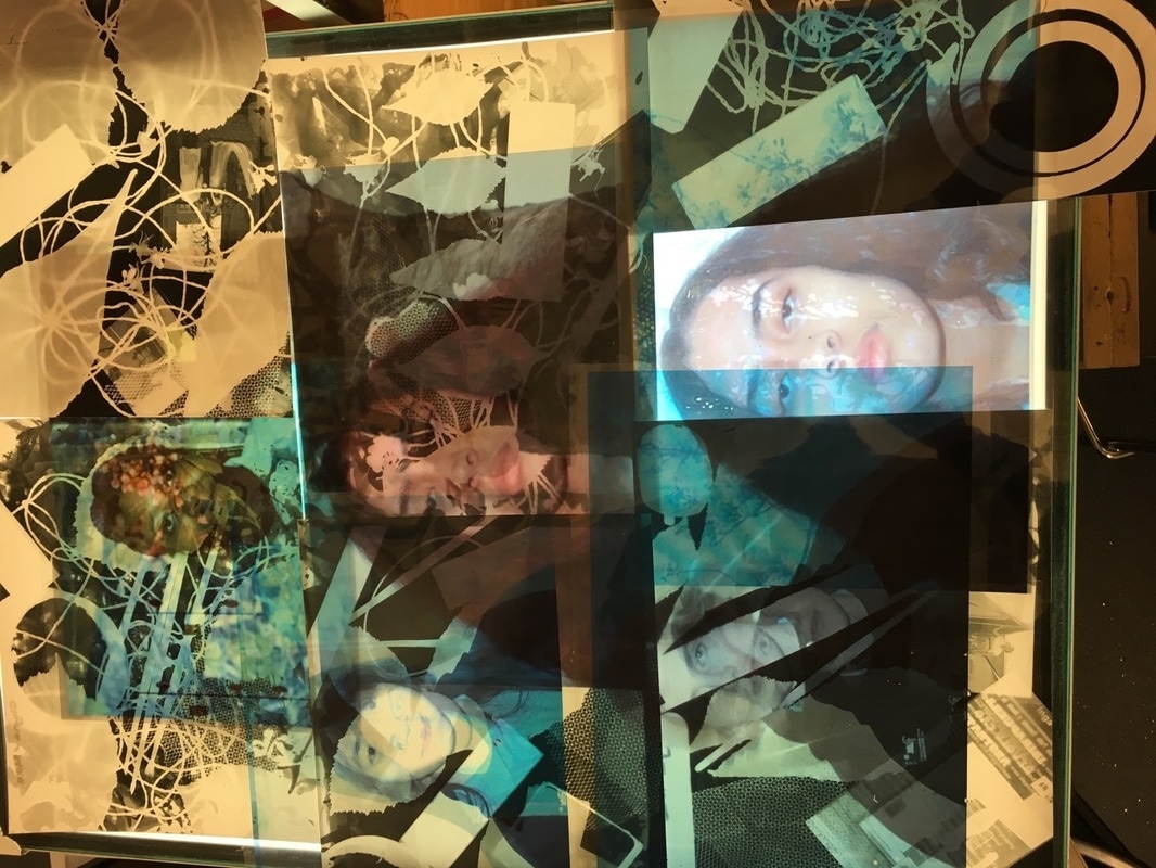
I made these images like the one at the top showing how I made these. I had transparent paper and put it on my photograms. I was using the light box to add light to the images to make it stand out and be more compelling to others. This is the pictures i'm using as my final pieces. I chose three images of these to add as my final piece and cropped it out.
I made more images to show I know how to use photoshop. These photos remind me of Justine khamaras ones in a way but interpretated in a different way because I wanted to make the images mine. I done this by using a tool in photoshop on the outside and you duplicate the image and circle around the head and move them around to show the underneath of the image to make it seem like there's two duplicate of people.
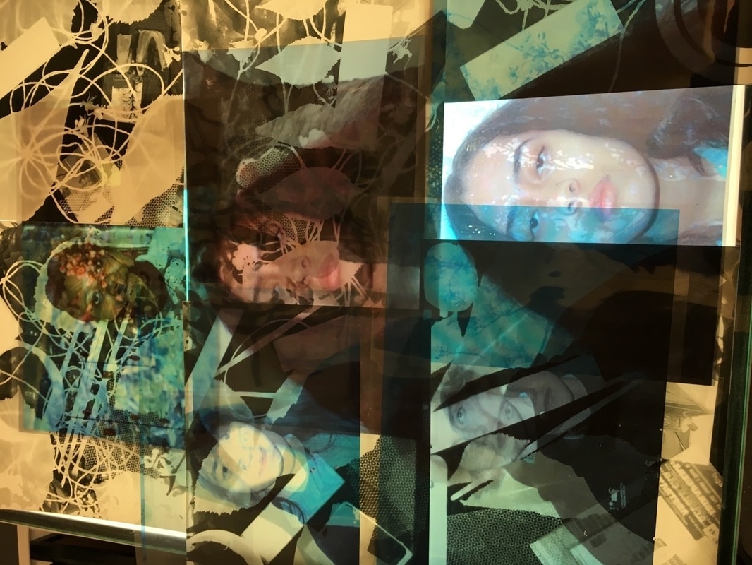
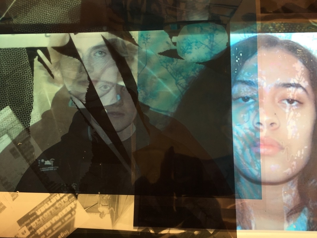
These are the transparent assotate photos. I went in the dark room and took the images with me and I put it on the photgram paper and put it in the fixer and water to make it come out like that and hung it up to make sure it was dry. The image of the girl was in the phtogram solution too long and it got rubbed off and darker.
transparent asssotate images
These are the transparent images that i used as photograms and I made sure it was clear and focused.
evaluation
The theme I chose is assembled, I chose this because I thought that it would be interesting to learn and I would do a lot of interesting experiments and make sure my ideas expand more and that it could relate to abstract which I have already done on my website.
Throughout the exam I had a variety of ideas and decided to try it out but also try to make sure that its still related to the theme assembled. I experimented in the dark room to do photograms. Also every experiment I done, it went a step further for me getting my ideas better and expanding on them to make them even better than before.
For my final outcome I was inspired but I wasn't by Justine Khamara. I was inspired by him to use peoples faces and change it up a bit and to do different things with peoples faces but I interpreted it in a different way. His photos are taken in a specific way, where he uses people and changes how they look. I found this interesting because instead of changing how someone looks I added nature to their faces. Also most of my pictures were black and white or colour.
I tried out a variety of experiments during my research and preparation for my final piece and what I should have as my final piece. I used a lot of techniques such as making photographs and printing out pictures with paper assotate and making a photogram with it. Making photograms creates a technical image. For my final piece I used photoshop to mix nature with peoples faces and changing the colour of it and making sure it is in focus. Also I made photograms with different and assembled them together, using different things such as paint brushes,sponges and tissue to put it on to make the photogram. I also had my photos with assotate and made more photgrams. I used a DSLR camera (canon) to take the photograps with as clear wanted them to come out.
I recorded every step of my ideas and all my observations and made sure that I showed evidence on my website. I made sure all my experiments were observed and showed all my thoughts on what I felt about it, even if it is bad I still put it on my website because you can explain what happened. I made sure I evaluated what I done on my images. This helped me to decide what I wanted to do next and what my final income should be and try to make sure the next photos come out better than the last ones.
To create a response to my final outcome, I had to make sure It looks good and a bit abstract. I was achieving to have a lot of brightly coloured photographs. I used assotate paper to show the image in a different perspective and the colours. I showed my understanding of photography by mentioning formal elements in my work.
Overall I am happy with outcome of my work. I used a lot of techniques and made a lot of images related to my theme and abstraction. Aslo I done a lot of research to decide what I wanted my final outcome to be and by doing this it helped. My final outcome was made by using photoshop and assotate paper with my photograms. By doing this I had to know how to use photoshop and arrange my photos and make sure it looks interesting and looks good for the theme assembled.
